On the web, data interpretation is defined by well-known rules. The semantics of data are defined by the system’s creators. Rendering is the end result of the two. But what if?
In a web browser, clicking a link initiates a deluge of data, yet we as users remain mostly unaware of this process. Aesthetic Engine 2 is an application which encodes an alternative interpretation/visualization of web data, and the highly opinionated, artistic rendering of it. It is an atypical web browser, but also a sculpture. It is open-source, and you can grab a build here.
Early experiments
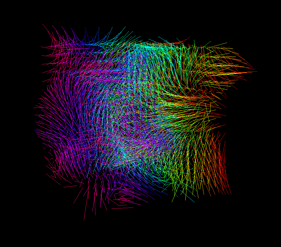
The endeavour started by exploring the structure of completely random vector fields. This was “the clay”, if you will.
I made a simple editor extension in Unity which visualized the field’s flow from a given starting point along a given number of “hops”. At each step, the current value of the field (direction + intensity) is read and the current point is translated along that vector. The process repeats, and in the end you’re left with a sequence of points, which can then be interpolated into a three-dimensional spline. By giving the algorithm several neighbouring starting points, the field’s flow is visualized very effectively.
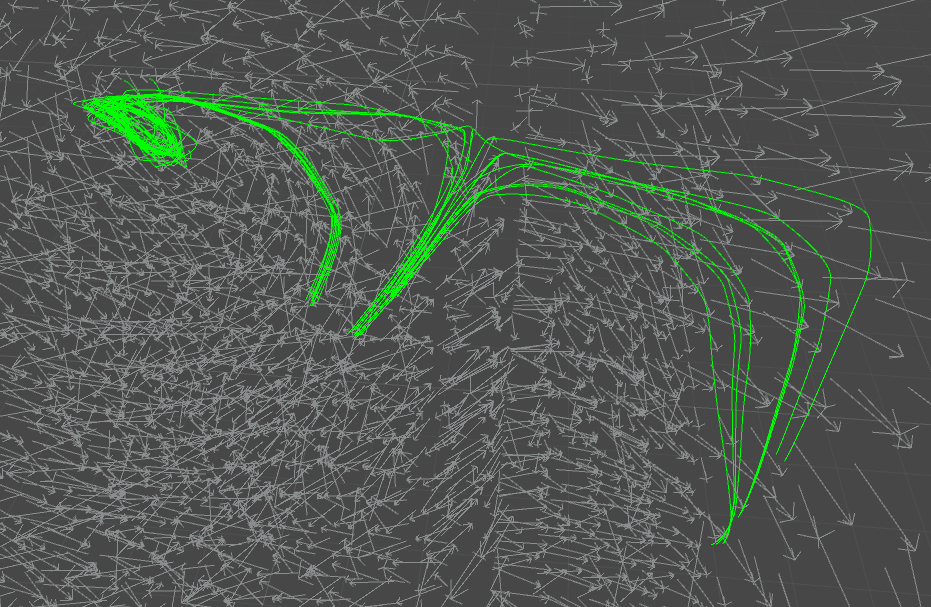
This formed a good basis for further experimentation. I could add more starting points and visualize the field in increasing detail.
The structure (or composition) is to me the most important aspect of every visual art piece. The definition of structure is the starting point for all my visual projects. It is the core element around which every other aspect is built, and my early paper sketches are mostly simple doodles of the structure I’ll be creating.
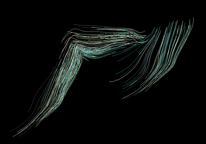
By carefully choosing starting points and length for this “walk” along the field, I could get a glimpse of the structural basis I’d be iterating on. I wanted to achieve a similar structural flow to the one I have on the logo project – the “unwinding” of elements horizontally while following the flow dictated by the flow field. However, I wanted much more visual complexity, so I knew that finding a balance between this unidirectional flow and the complex web of individual nodes would be tricky to obtain.
Switching the technology stack
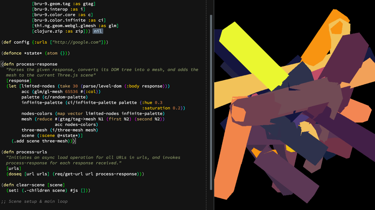
I felt the need to go back to the open-source community after years of working professionally using proprietary tools. I had my eye on Three.js for a while, and Clojure/ClojureScript were my old buddies at this point, so I decided to give the combination a go.
The thi.ng library is an essential tool for anyone using Clojure(Script) for computational graphics, so I dug into the code looking for the tools which would help me convert the splines to extruded 3D shapes. Karsten Schmidt, the creator of the library, kindly pointed me towards the parallel transport frames (PTF) algorithm, which of course he had already implemented in thi.ng. I gave it a quick shot, with randomly connected line segments.
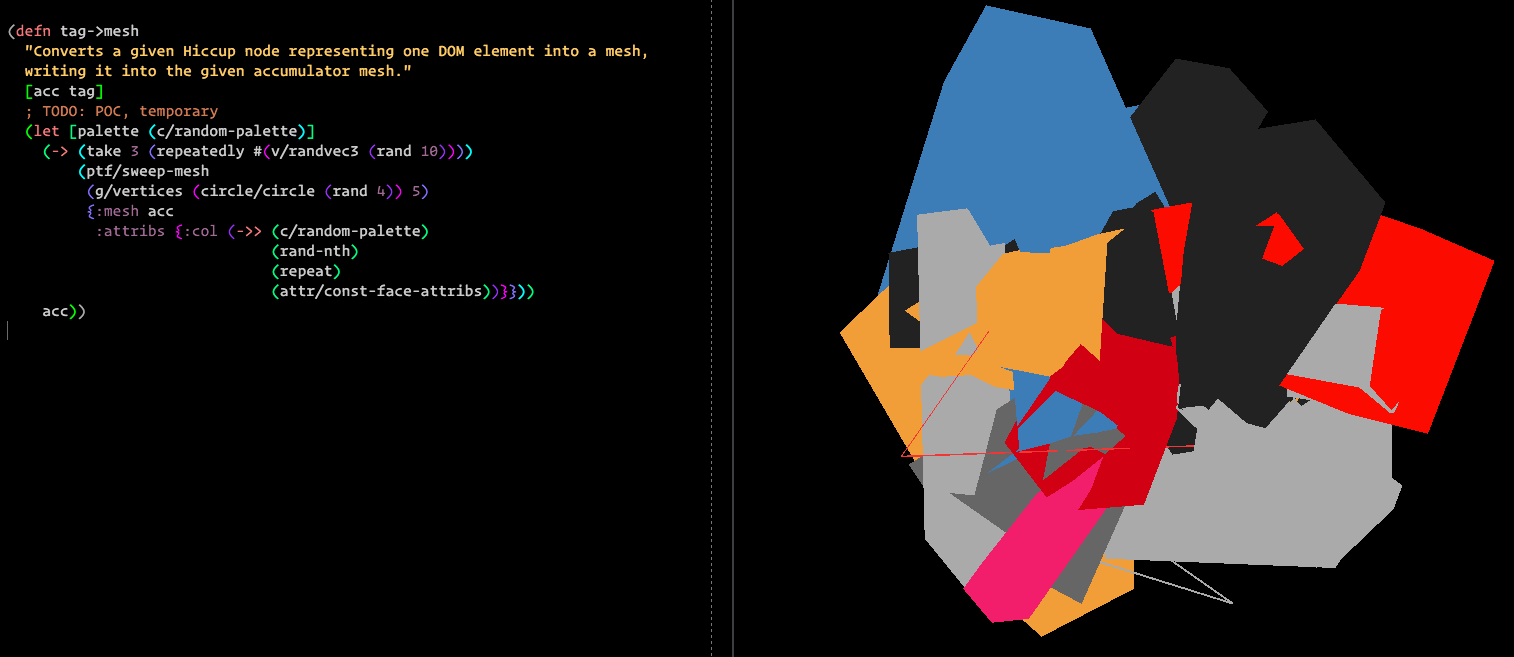
In parallel, I worked on the boring stuff – URL loading, data parsing. A simple mapping of HTML nodes to PTF shapes was made, as a basis for further iteration.
I had a two-dimensional implementation of the linear flow field lying around from the logo project, so I converted it to three dimensions.
At this point, the basic ingredients for defining the structure were there – the 3D flow field implementation, the “field walking” spline algorithm, and the PTF algorithm.

“Make it pretty and ship it”?
At this point the project started to get some aesthetic appeal, even though it was using plain OpenGL lines to draw. I could have easily spent some time making it more approachable to the public (fancy shading etc), but I decided that, in general, this is not the route I want to take.
While working with iterative visual systems, it is very often not clear at which point the project is complete, and I’m certainly not the first one to say this. The creative process is idolised by many as the main driver behind the end result – be it an art piece or a designed object – but I beg to differ.
Letting the creative process drive your thinking sounds to me too much like “we just tinkered until we saw something we liked, and then invented a narrative to explain it”. This is just ridiculous. Following through on the initial concept is hard work, tinkering is easy (although necessary).
Also, due to the nature of procedural work and the enormous possibility space that each additional parameter opens, letting tinkering guide the way can certainly get you somewhere, but is that where you wanted to be? As a system designer, it is your job to ruthlessly mold the system to your liking, not let it diverge until you like it. Ultimately, understanding the system is key, and letting divergence rule is irresponsible at best.
So this was the time I was at an inflection point – should I just spend some time making these wireframes into “prettier” renderings? More likeable? More heartable? My Instagram feed needed love.
No. I still didn’t reach the structure I was looking for, and I still didn’t do any real work with visualizing the web data that was waiting for me, parsed and idle.
The complexity
Having just one field visualizing the flow of data felt too tame. “The flow of data” – sounds so tranquil, doesn’t it?
Have a look at this very small fraction of google.com’s source code and think again:
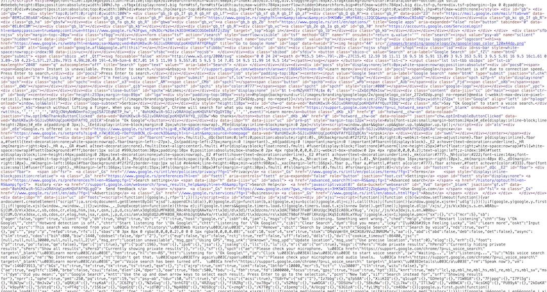
This is what that slick and minimal search box really looks like. This is our reality. It is not tranquil at all.
There’s a clash, of human understanding and the cold processing power of the machine. A web of connectedness beyond our grasp, buried deep inside the data our brain is never meant to comprehend. Systems touching each other, communicating, pretending to not be there at all. In this world, but not of it.
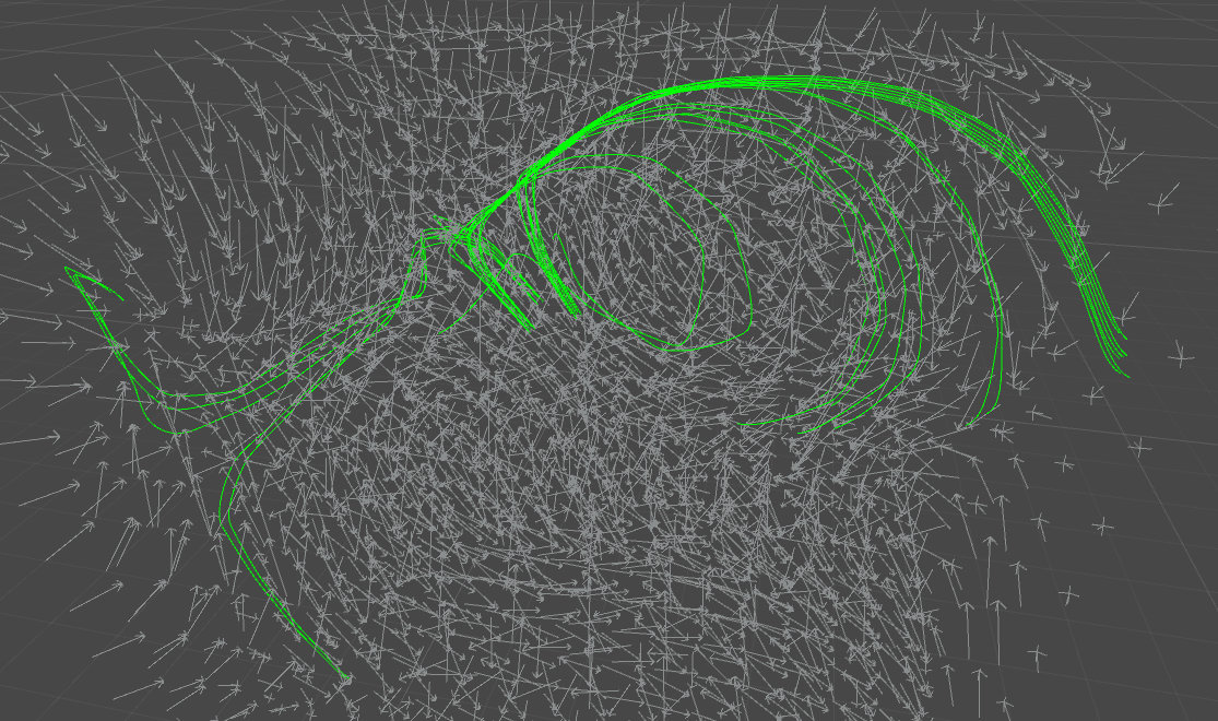
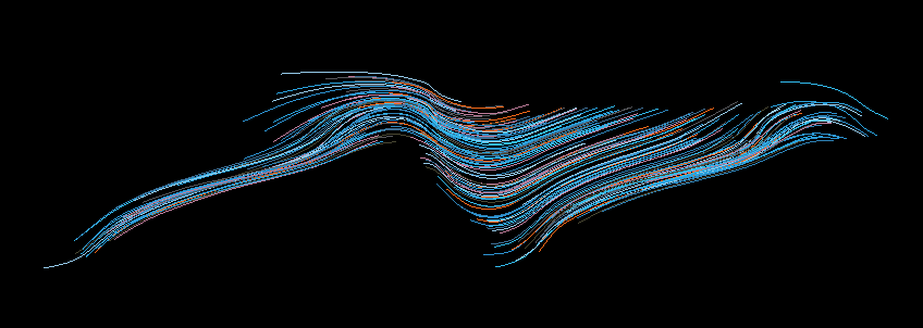
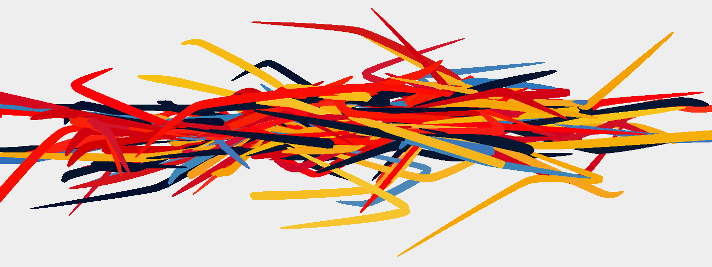
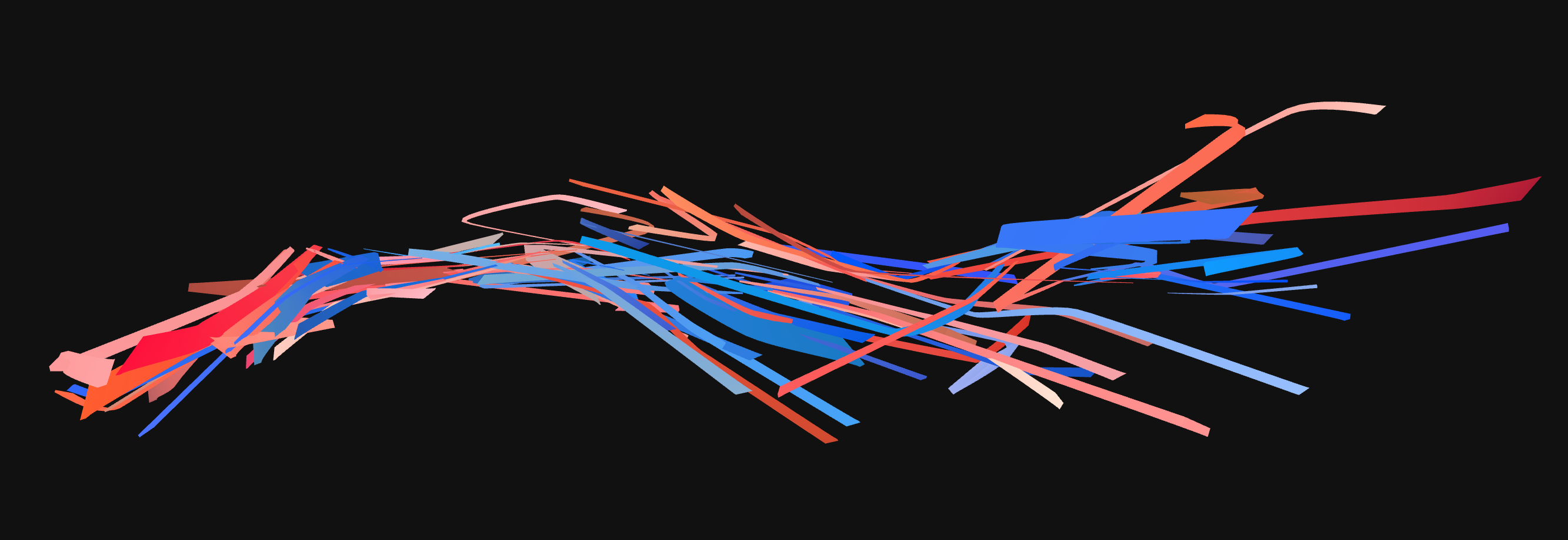
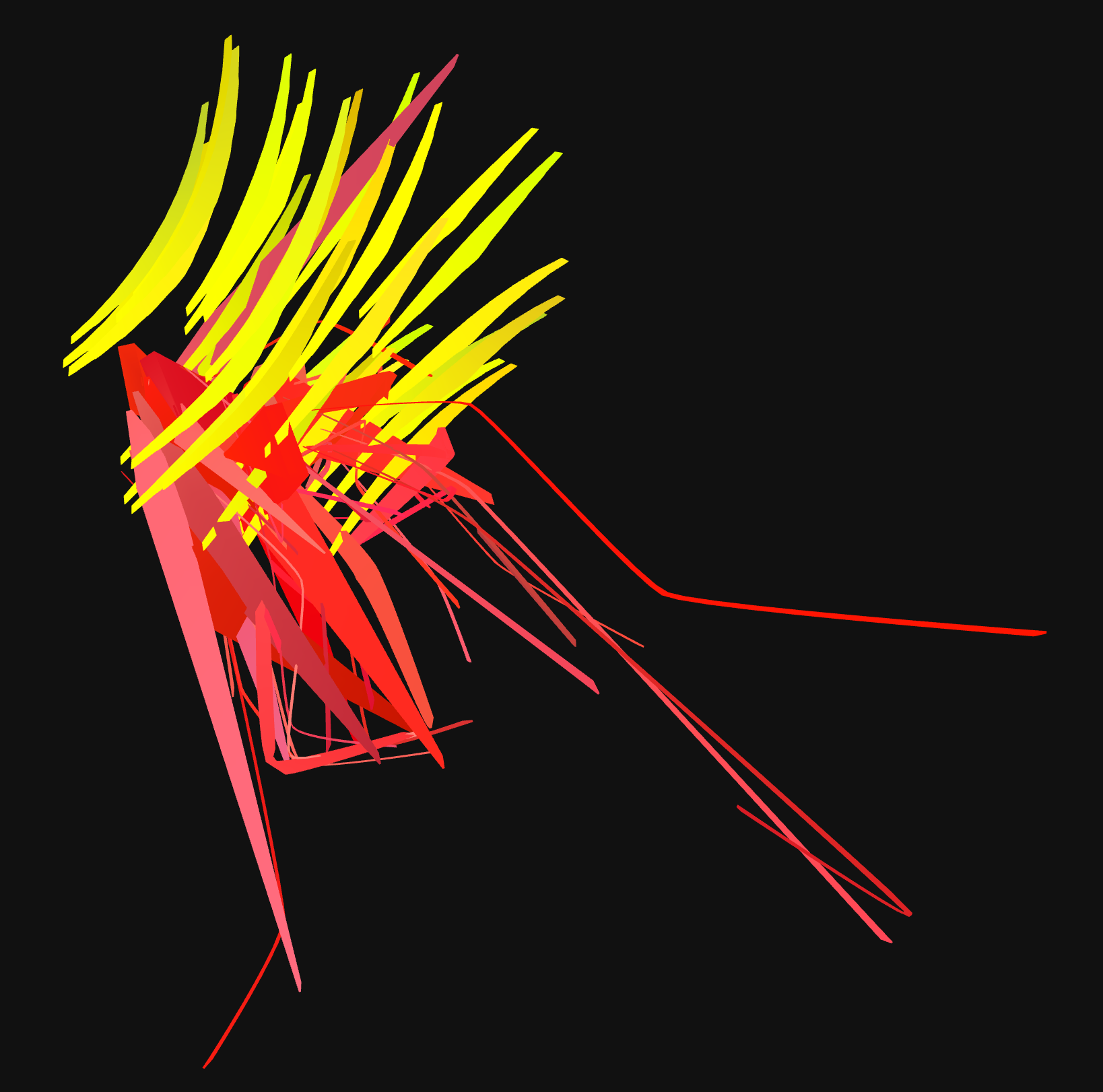
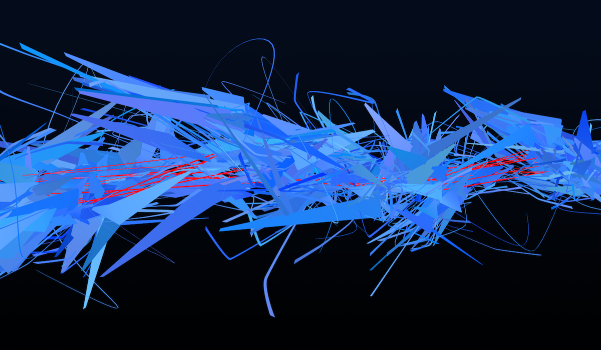
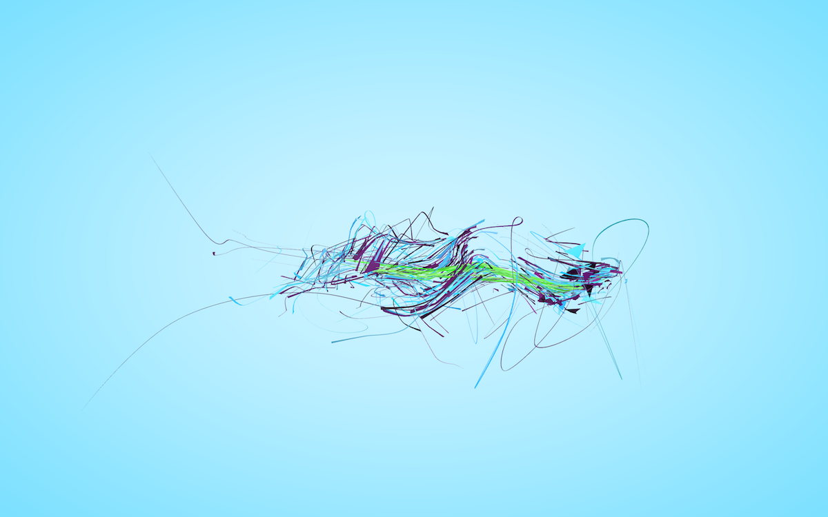
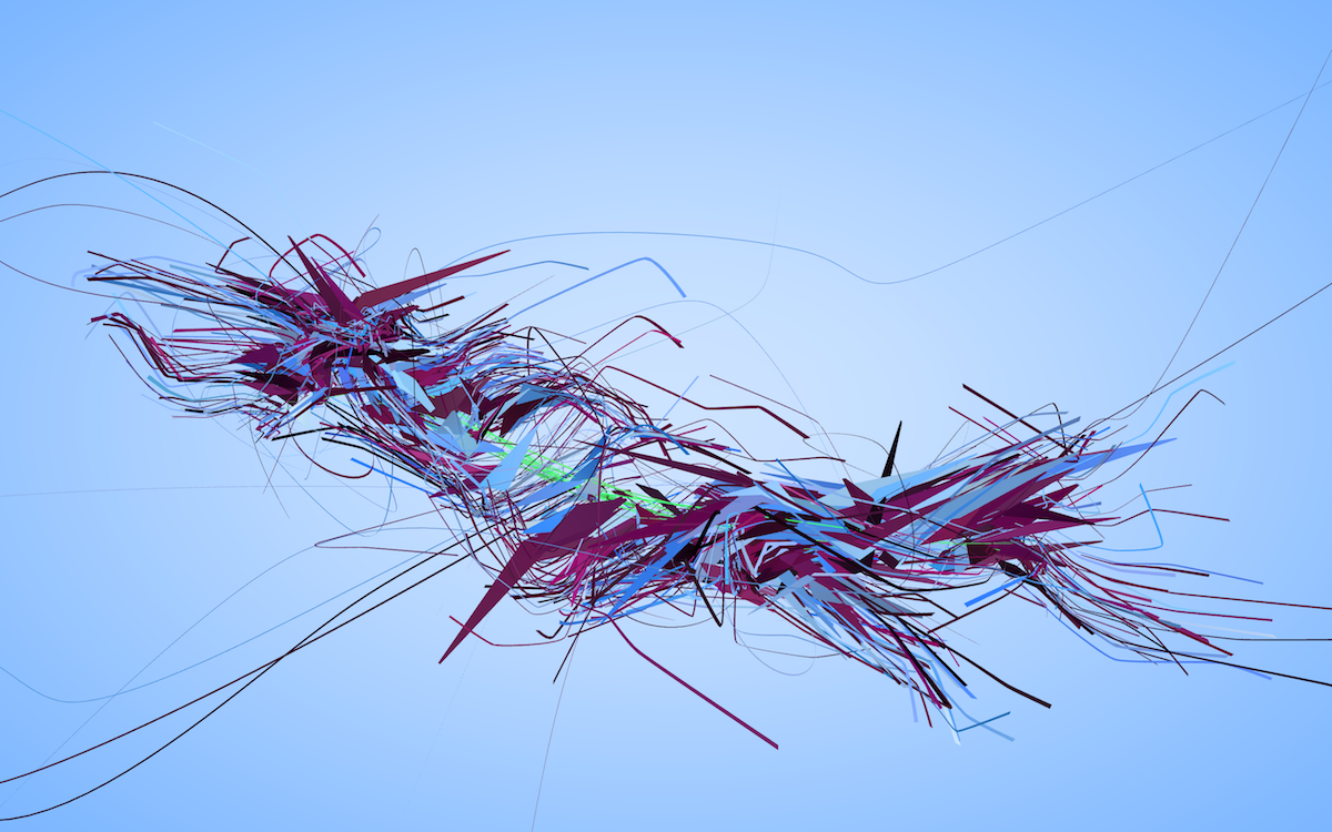
I introduced the second field into the picture because I wanted to represent this clash explicitly, but on the other hand I didn’t want it to be too obvious. The two flows had to be present, but not immediately discernable. I experimented with different visual approaches and finally created the “field switching” method, where as each spline is created, the source field it’s currently walking is being switched underneath it occasionally.
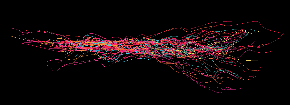
The drawings easily became too chaotic if the parameters weren’t kept in check. Switching between the fields too often, reducing the length of spline segments before switching fields, making fields follow opposite directions – all these contributed to chaos and reduction of structure.
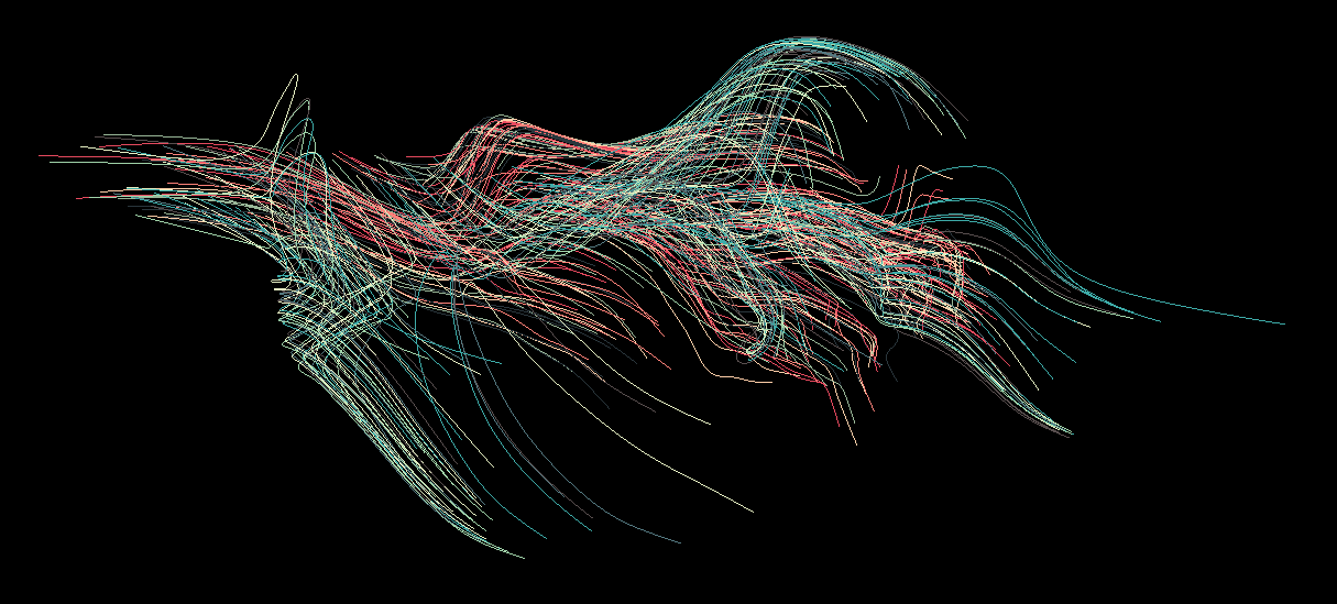
I was slowly learning how to tame the parameters. I liked the balance between the primary field dominating the shape and the secondary one introducing occasional glitches and direction shifts. The two pictures above show this. The structure is clearly visible and complemented by the added details of the secondary field.
I should also note that on these wireframe screenshots things might not be looking that dramatic, but I knew that parsing web data is unpredictable and I was getting ready for parsing and displaying thousands of these “strands”, which required that I carefully consider not just the flow, but also the spacing between elements, probability distributions, camera framing, and so on.
It was time to give some “meat” to these wireframes.

I customized thi.ng’s PTF implementation to be able to vary the frame radius as it was transported along the spline, effectively giving me “brush” aesthetics. I later experimented a lot with these three-dimensional brushes, but first I had to let the geometry rest for a little bit and shift my focus to colors.
Palatable palettes
Right around this time I was finishing the Machine Learning course on Coursera, and I was tinkering with writing a neural network from scratch in Clojure as an exercise to help me really understand how NNs work. I had an idea of training a neural network on some set of color palettes and then using its knowledge to generate new palettes. I knew I would need lots of training data though, and I had none.
I thought about crawling various color palette websites for palettes, but that would involve writing specialized crawlers and parsers, and the problem of actually classifying the palettes would still be manual. So instead of using other people’s palettes, I created a very simple palette generator.
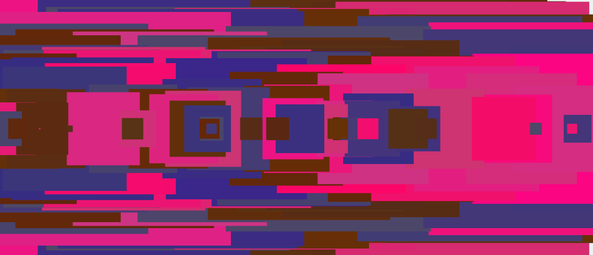
I specifically did not want to present the colors as you usually see them presented in color palettes, laid out next to each other. I wanted to get a better feel for what they would look like once in use, so I came up with this simple rectangular overlay method. The palette above has three colors, but every time I draw a rectangle with the chosen color, I vary the hue just a little bit, so the final image has more visual diversity. It’s fake, but very effective in my opinion It actually reminds me of those 8-bit top-down shooters, so I pretended I was looking at a map of a game level, in order to trick my brain. It worked. .
I then made a very simple feedback loop – pressing Y or N would save the current palette as approved or not approved, and generate the next palette. With this scheme, I could generate training data very quickly. I had around 20% of “approved” palettes, which is more than I expected from a randomized generator.
Once I started training the neural network with the data I recorded, I ran into problems. No matter which hyper parameters Hyper parameters are used for configuring the training process. The neurons in the network have their own parameters which are the main target of training, so these process-describing parameters are called hyper parameters, to distinguish them from neural network’s parameters. I chose prior to training, I could never get the error rate to acceptable values. I won’t get into technical details here, but it turned out that even though I had around 2000 training samples (which took a lot of staring at the screen and pressing Y/N), the data didn’t have enough information for the neural net to infer any meaningful patterns, so it always converged onto “the middle ground”, trying to minimize the error among data which it saw as quasi-random.
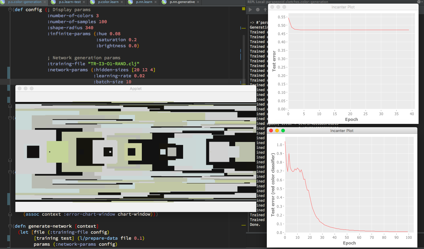
I tested my NN implementation against a very simple training set to prove that the implementation itself is not the culprit, and it worked. In the picture above, on the bottom right you can see the error rate go down to nearly zero. That particular instance is a simple single-color RGB classifier trained to recognize the red color. It worked flawlessly. However, once I expanded the classifier to three colors, the error always settled around 0.5 (the graph on the top right). I tried the process with two-color palettes as well, but still, the 2000 training instances weren’t enough.
If I were to return to this method in the future, I’d use a pre-specialized palette generator instead of a completely random one and use only two-color palettes, in order to minimize the amount of inference the network has to do.
I declared this experiment as failed and moved on.
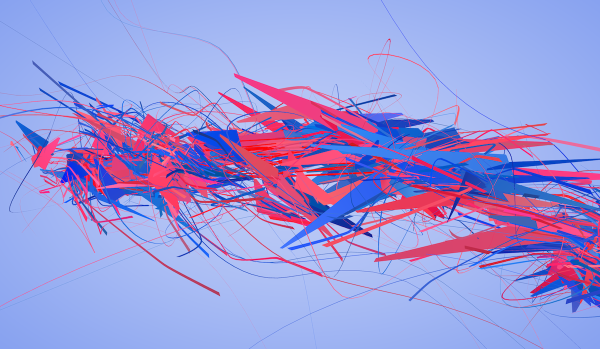
Adding spice to the structure
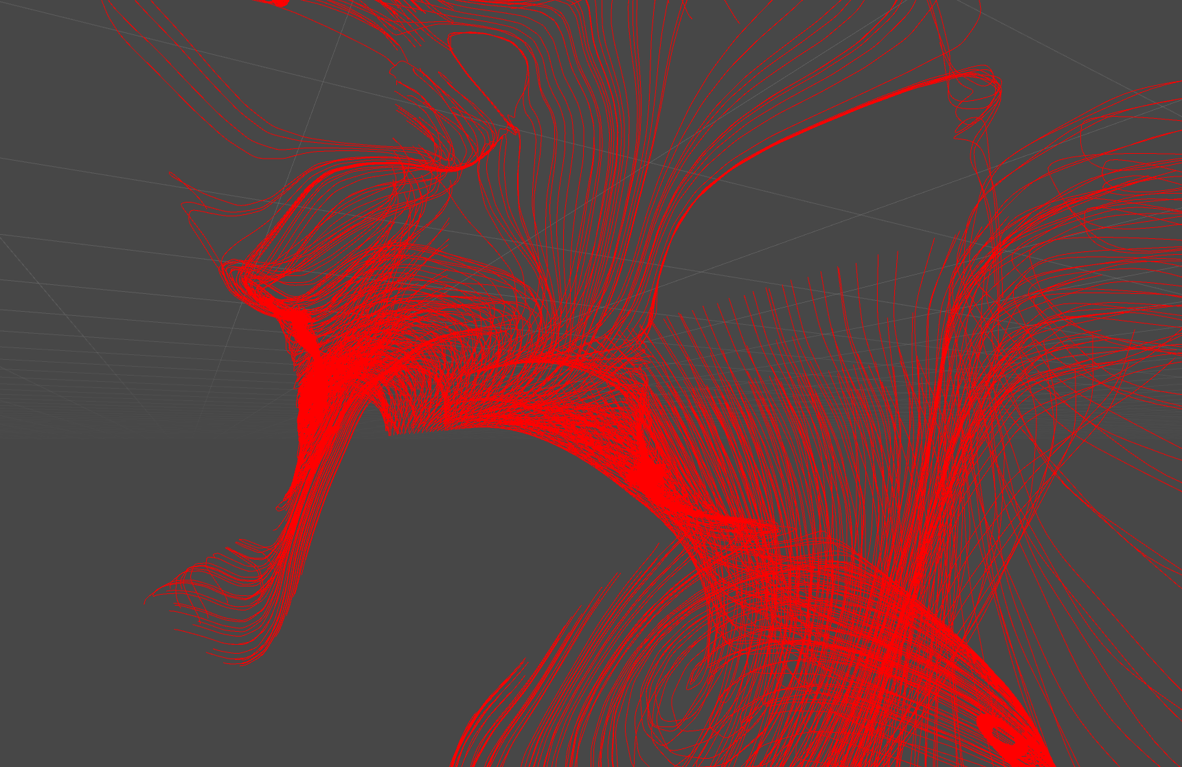
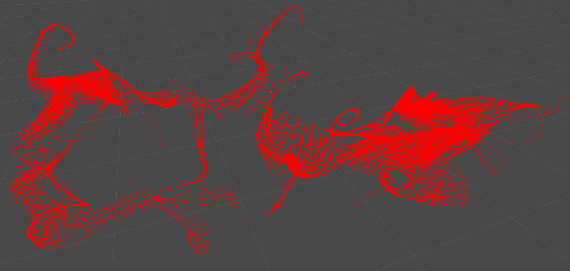
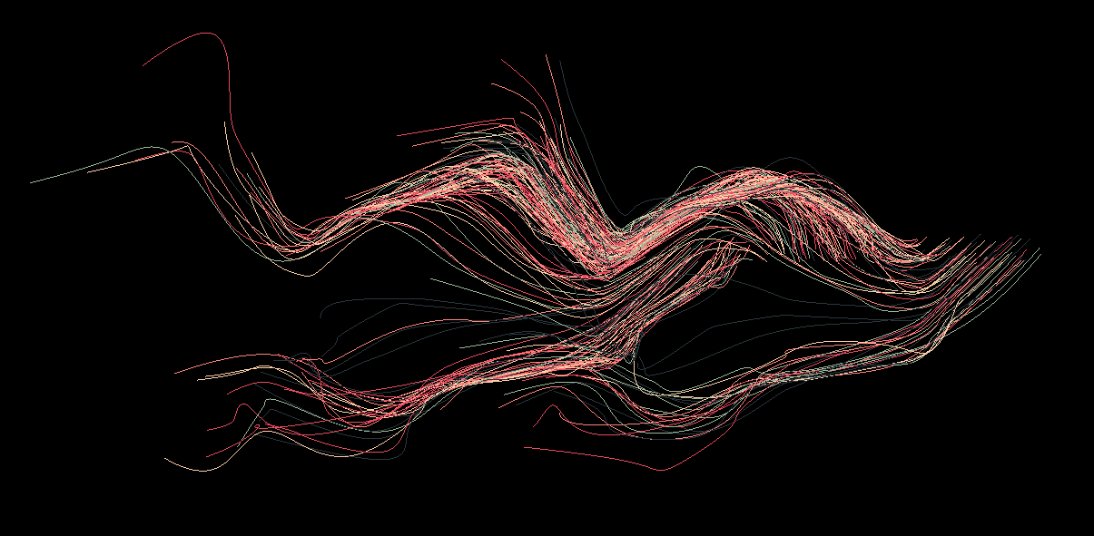
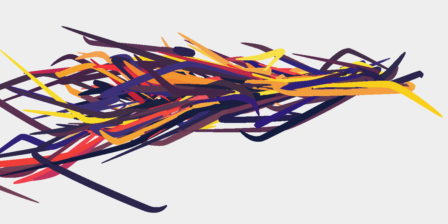
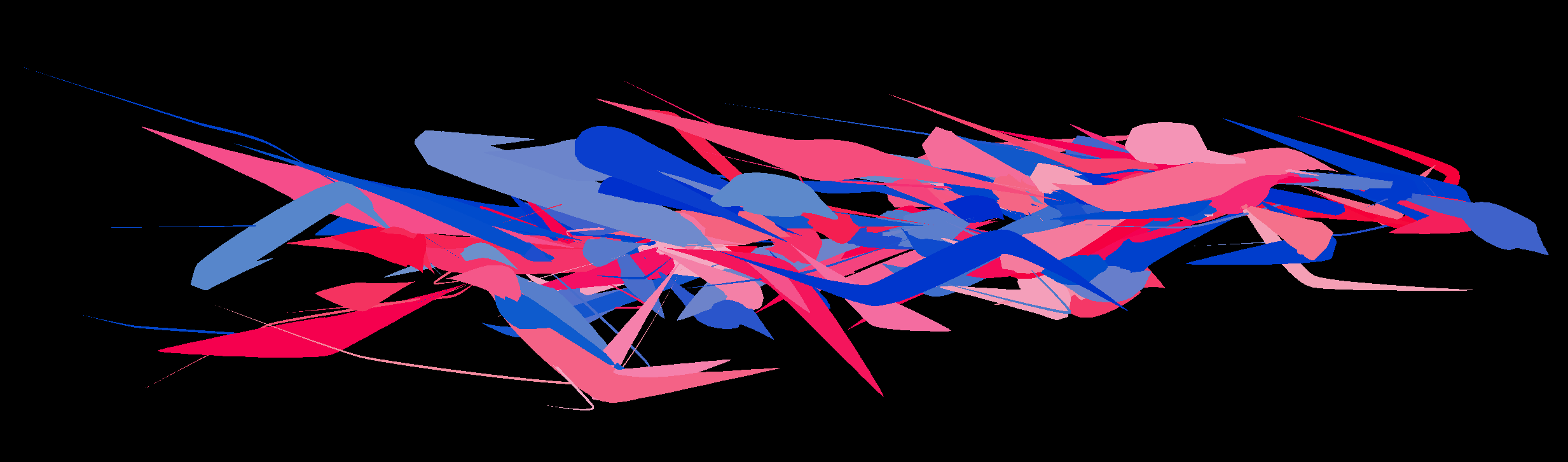
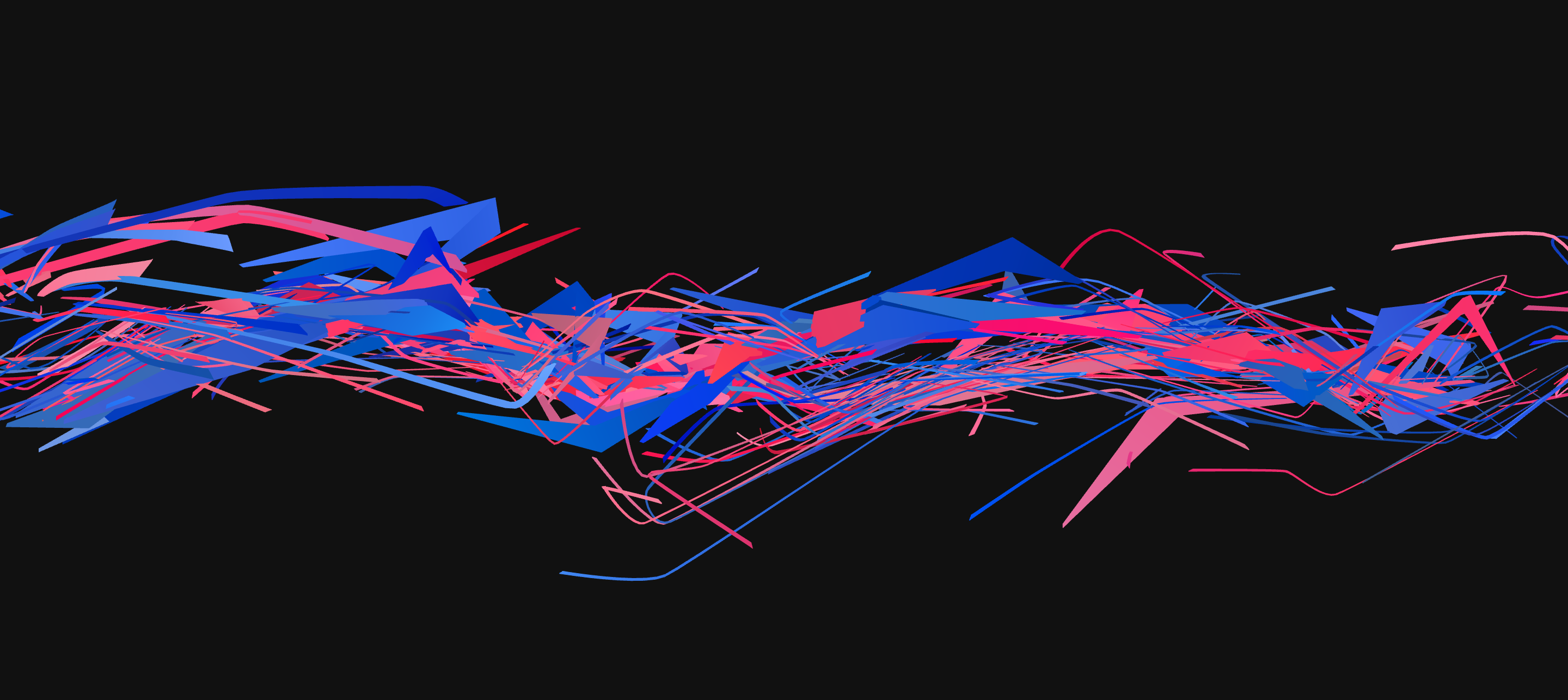
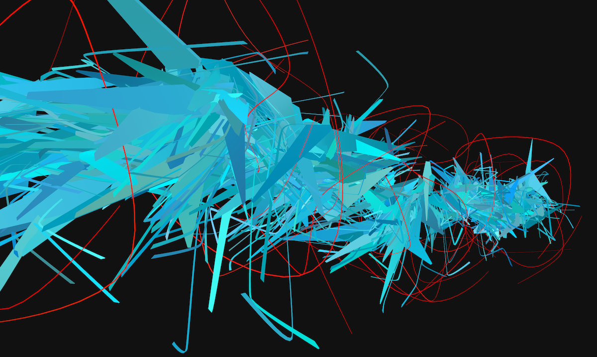
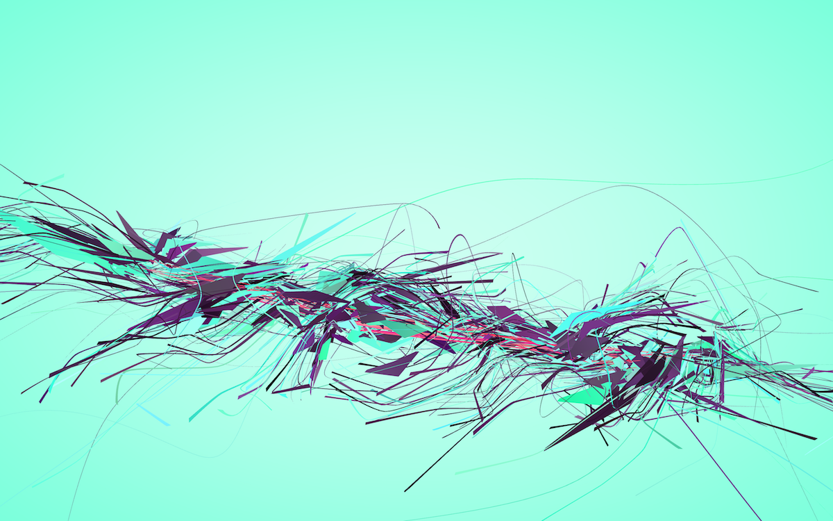
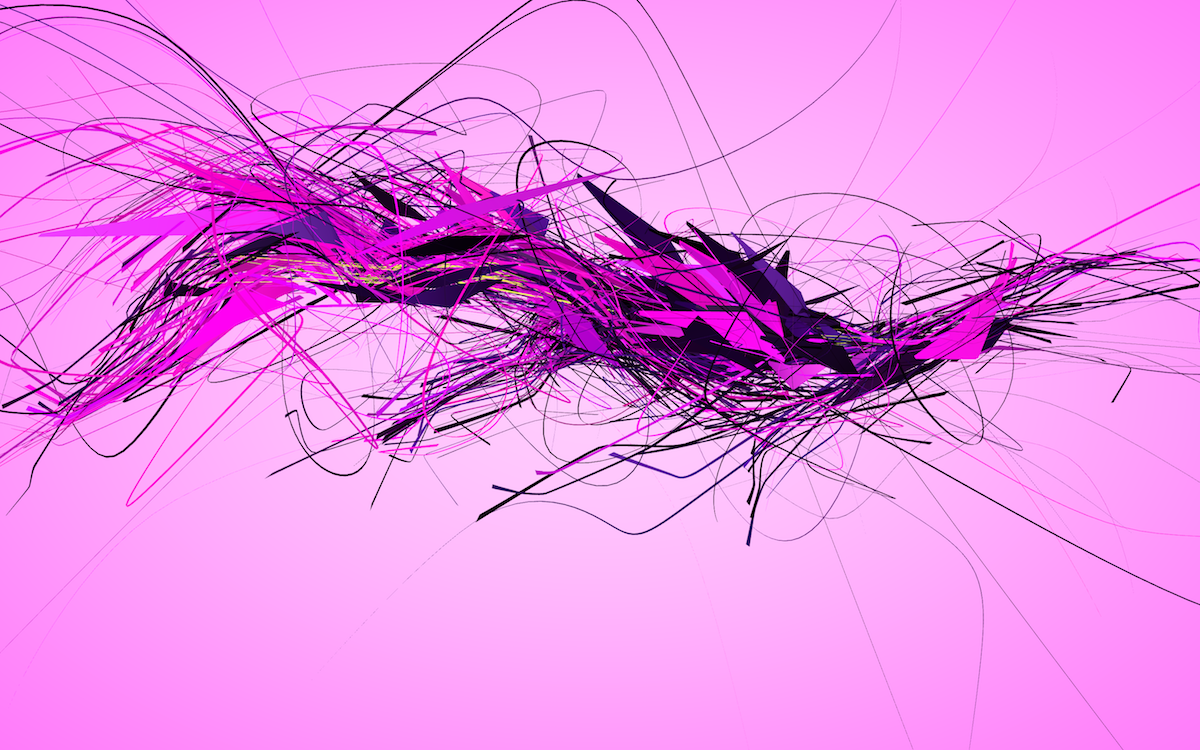
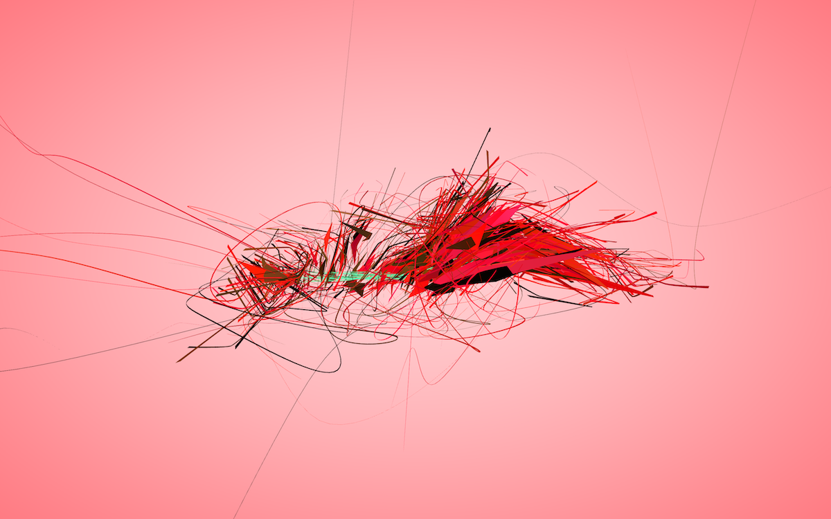
I knew that in order to reach higher levels of visual diversity, I had to improve the way individual “strokes” were rendered. The sculptures were still being hard-limited to around one hundred HTML nodes, whereas typically websites have on the order of thousands. Even though the structure was promising, showing all nodes as spiky tubes of similar radius was not a very good way to visualize the data. So I got back to iterating on the geometry.
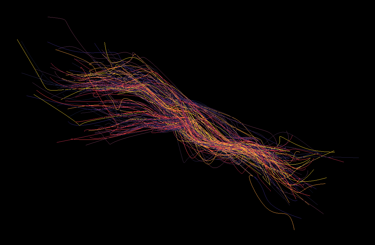
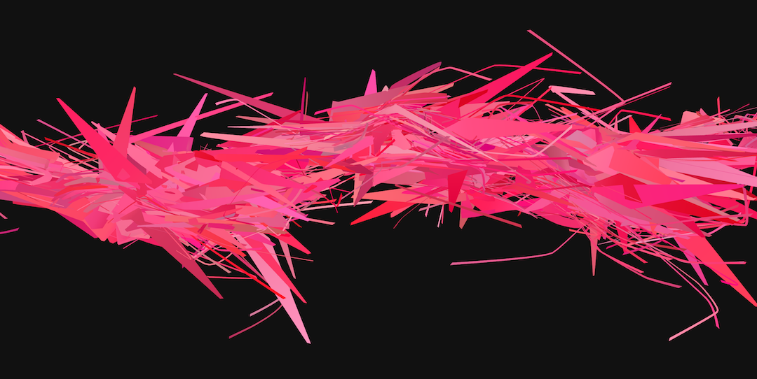
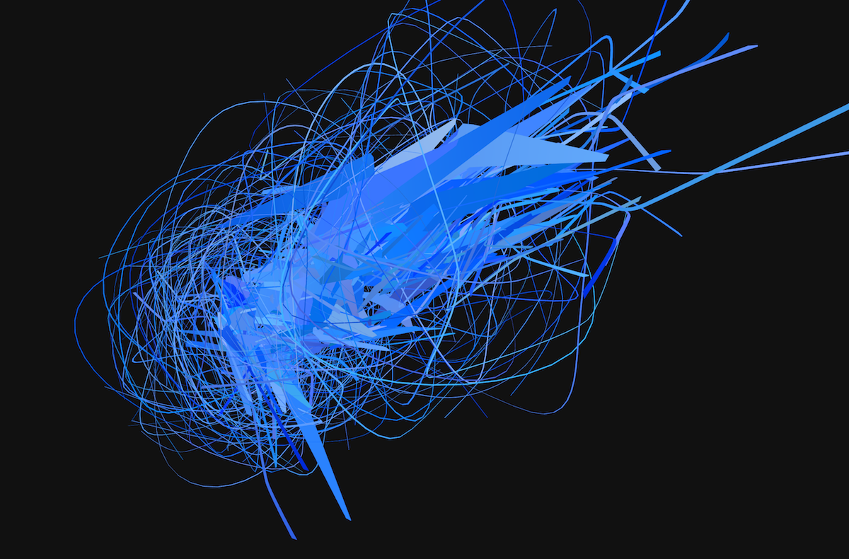
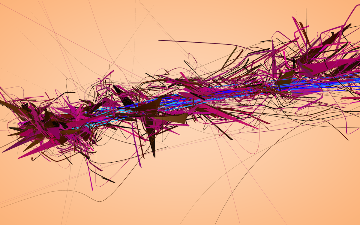
I should mention that at times there are parameter combinations which inadvertently give you ideas for future projects.
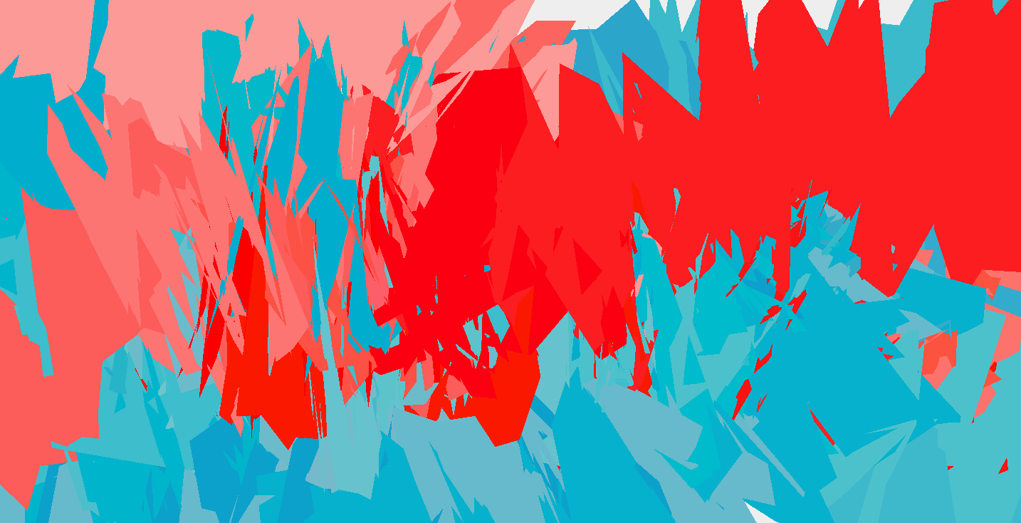
The triangle clipping and color interplay going on horizontally across the middle of that structure is just beautiful. But anyway –
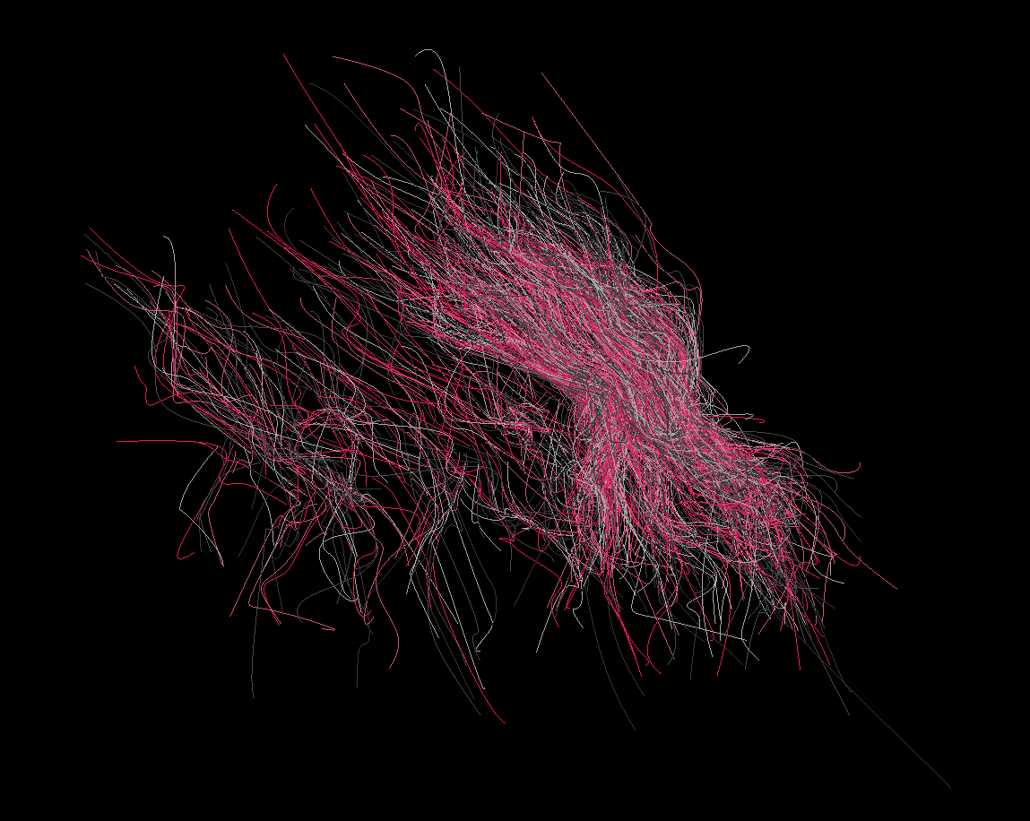
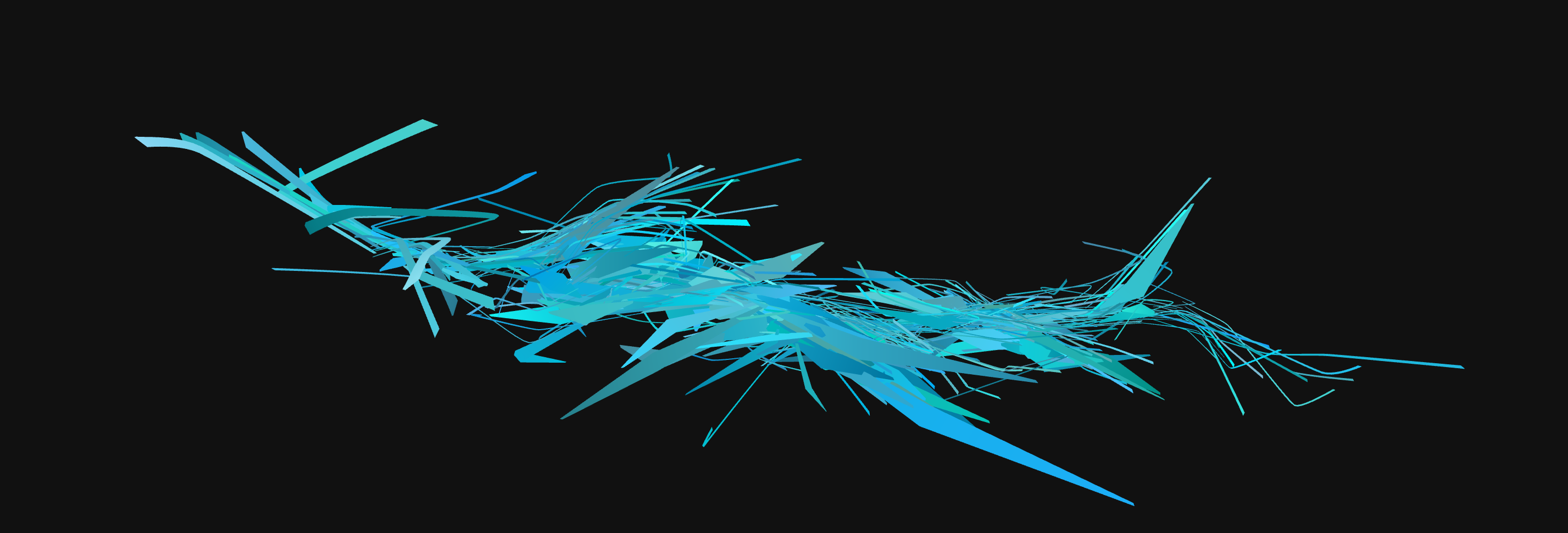
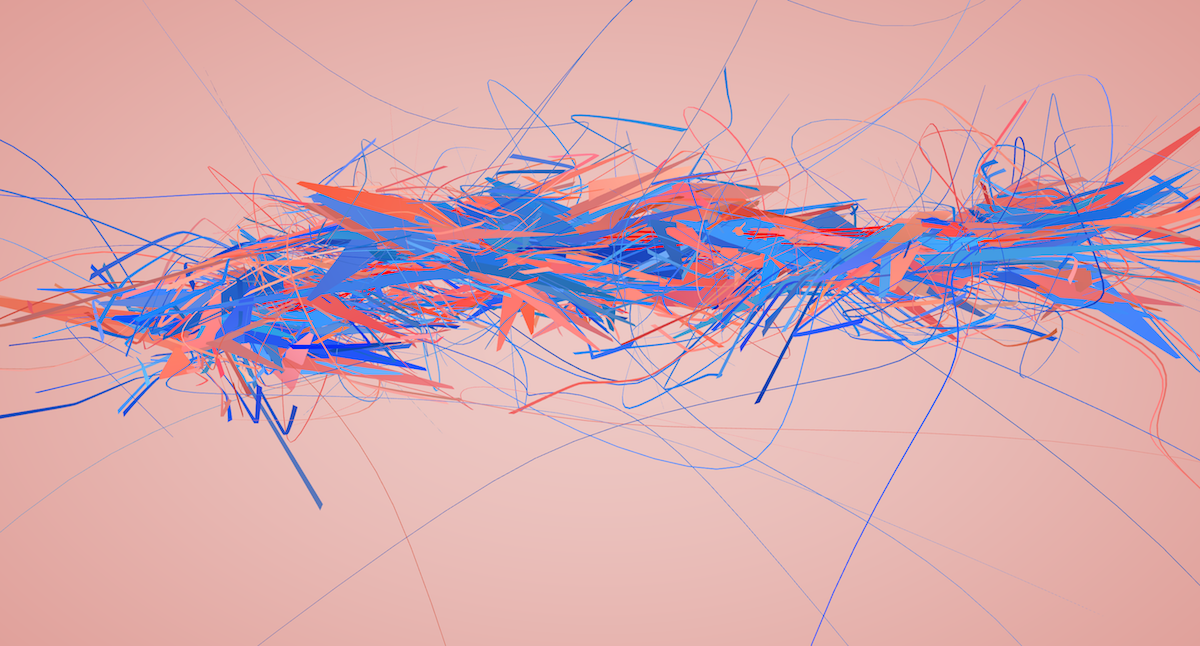
I also experimented with using a purely grayscale aesthetic:
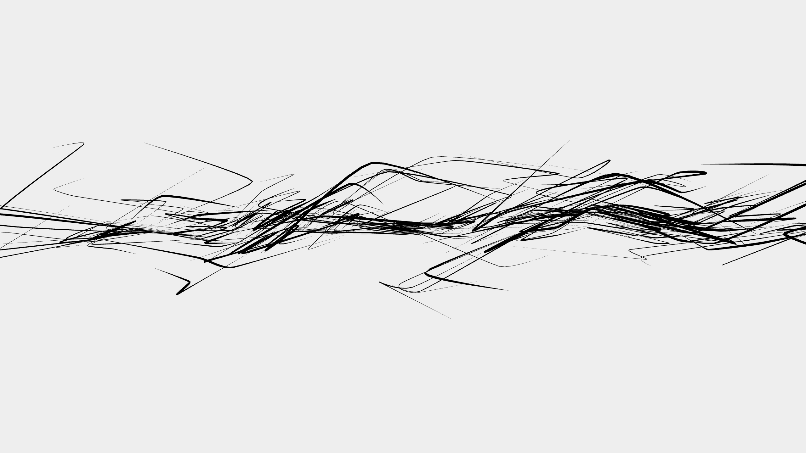
I still like how this style looks, but in general, my stance on using grayscale is that I feel it’s a cop out. Colors are hard. Grayscale is easy. Many people I respect have a distinct black and white aesthetic going on, and at times I am tempted to use it myself but I always feel like I’m cheating my way out.
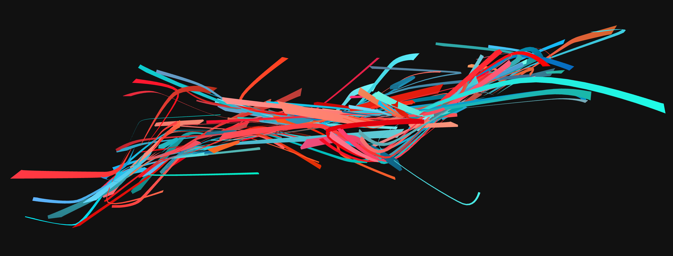
I switched back to full-color and proceeded to improve the geometry for the next several weeks.
Classification
I wanted to communicate the different types of data each web page contained. The visual throughput was already increasing quickly, and I didn’t want to complicate things further by introducing many different classes. I settled on the following classification:
- Content (user-visible stuff, as rendered by conventional browsers)
- Scaffolding (nodes defining the structure of the web page, not visible to the user)
- Header/Meta (data most useful to search engines)
- Executable/External (Javascript code, external files such as CSS)
- Outgoing links
I then started playing with different rendering styles and rules for each of these categories.
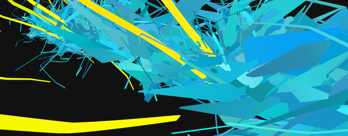
At this point, all the ingredients were there. Header nodes were forming the “spine” around which other nodes were to be drawn. Content nodes were being rendered as thick triangular slabs emanating from the spine, making them heavier against other nodes. Scaffolding was surrounding the content with thinner, supporting geometry. The algorithms of external Javascript files were wrapping themselves around the structure, while external links were shooting from the center outwards.
We done?
Then came the infamous “let me just tweak this one final bit” period. It went on for a couple of months, as usual.
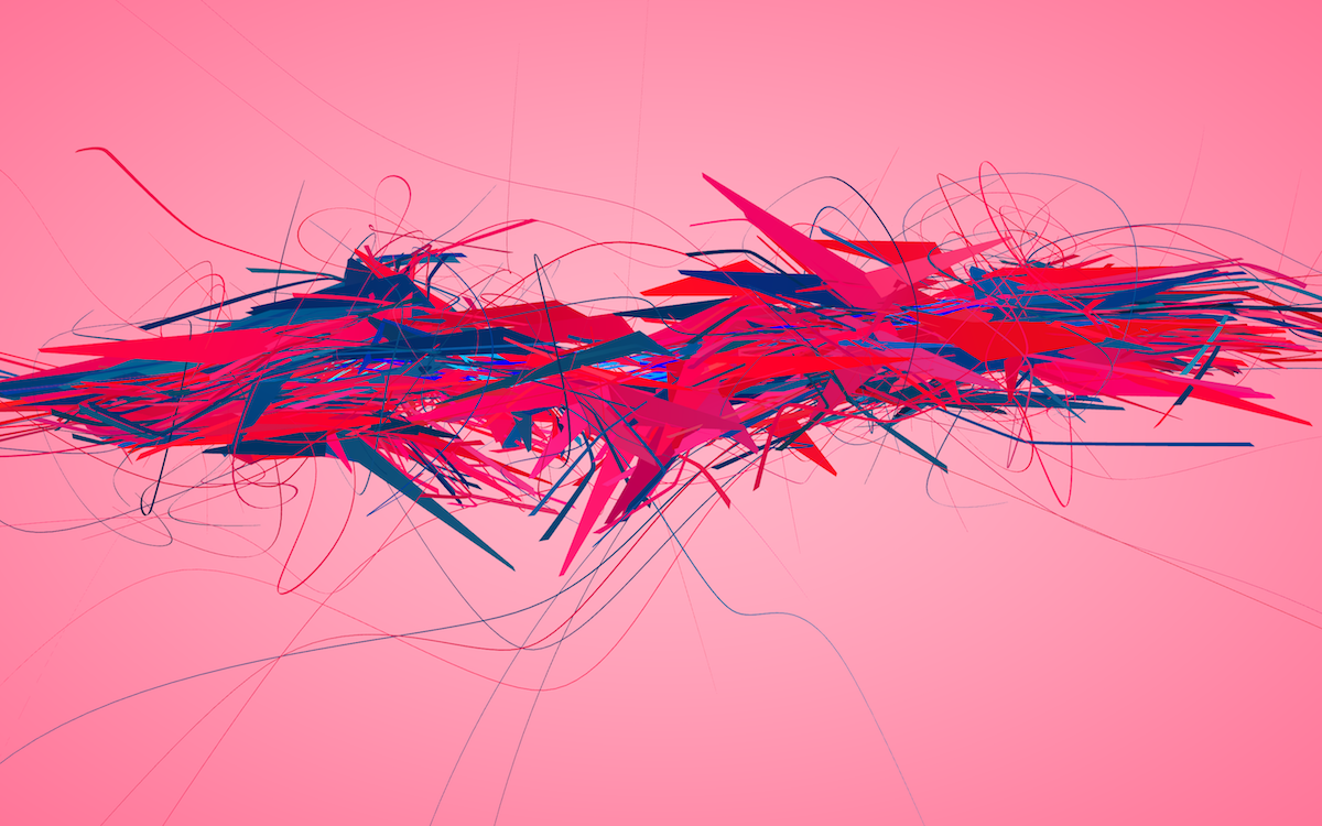
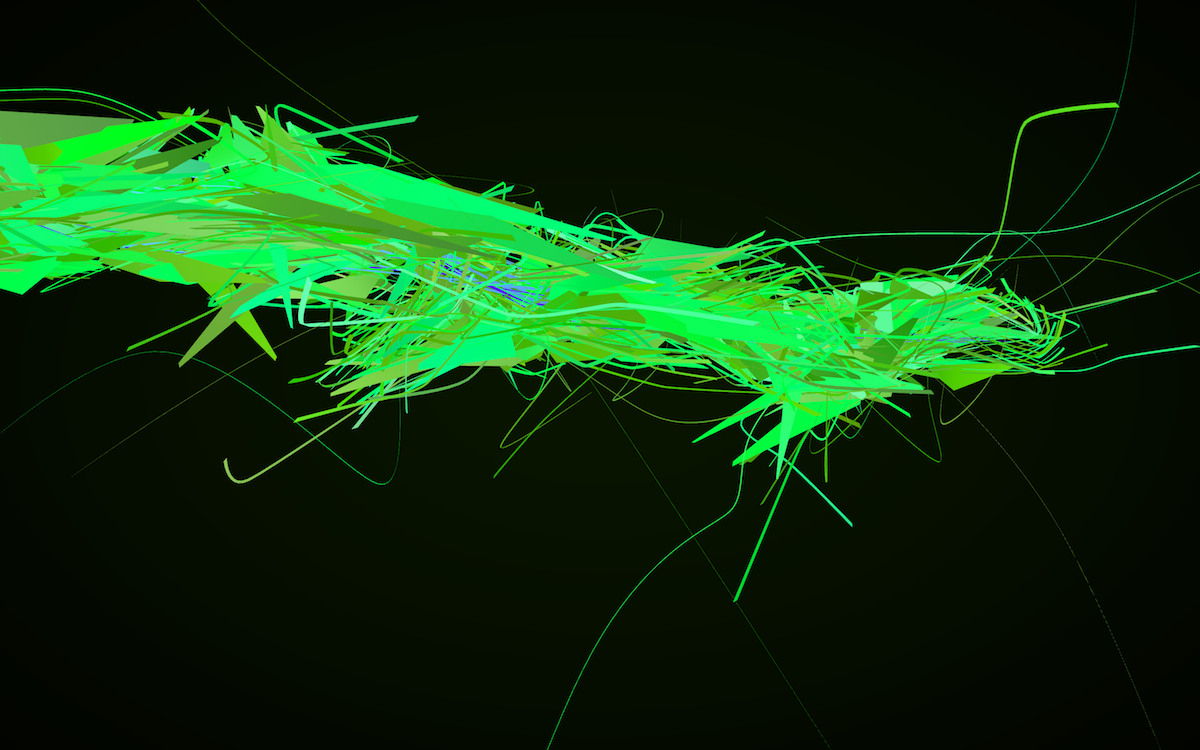
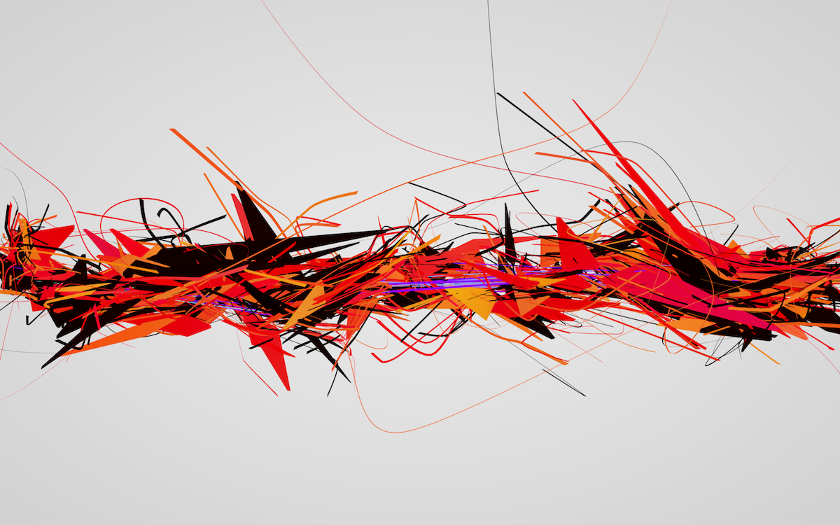
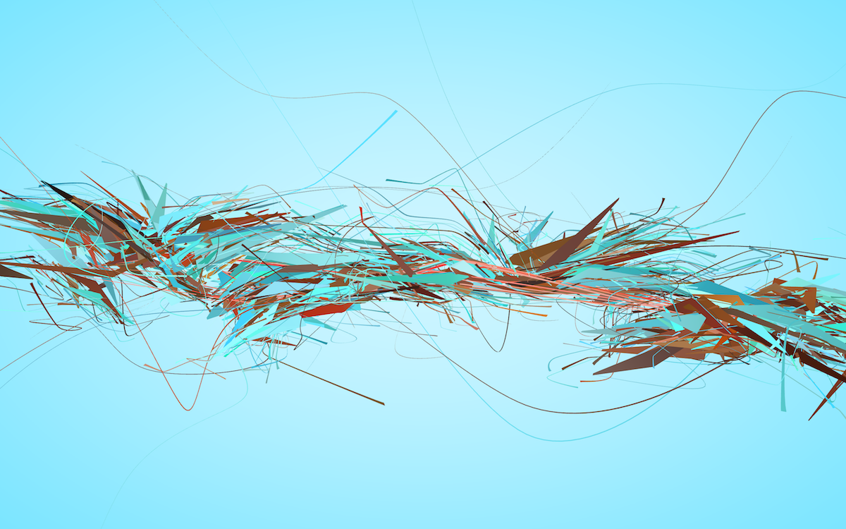

Feeling 90% satisfied with how things turned out, I did some grunt work on packaging for various platforms and released the project.
What next?
This was my first go at data dramatization, which is a process I hope to continue practicing in the coming years. It was quite an exhausting project for me, mostly due to technical reasons which I explained at length in my note on tools.
I probably won’t be focusing my efforts on color palette generation anymore. It is a huge topic which I’d be lucky to have time to explore at some point, but for my current temporal capacities it’s just too complicated, and all the solutions I came up with thus far either weren’t satisfying at all, or just outright failed. Looking forward, hand-picked palettes with a sprinkle of algorithmic variation will do just fine.
As for geometry, I’m very optimistic. Structurally and visually, I’m pleased with how Aesthetic Engine 2 came out. Computational geometry is really my home turf, and starting this year I’m switching to a more bare-bones approach, closer to the metal with C++ and thin OpenGL wrappers.
Finally, on a conceptual level, I think the project is communicating its message quite well, although it does require at least a little bit of explanation beforehand. The omission of UI was intentional, as I wanted the product to represent a painting/sculpture and not your typical software piece with tutorials and whatnot.
My upcoming projects are going to focus on visualizing processes along with data. While visualizing web data at rest was challenging, I feel that there was lots more to be said about the flow of information, both temporally and spatially. It is a fascinating subject and I’m eager to take a stab at it very soon.