During the late 90s and early 00s I was active in Belgrade’s graffiti scene, and I developed a certain aesthetic taste which has kept evolving since then. For designing this generative logo, I wanted to fuse my love of generative art, system modeling, and Belgrade wildstyle.
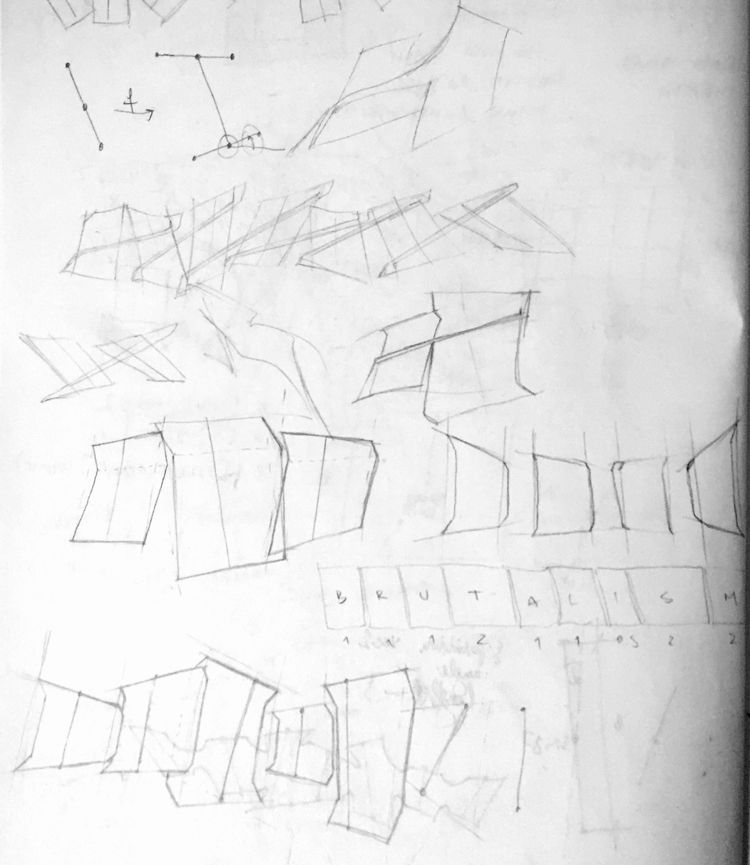
I started by throwing rough sketches on paper and playing around with potential rules for the generative version. At this stage, I had no specific style in mind, but I had a very clear vision of how the logo should “flow” and what its proportions should be.
From these early sketches, it became obvious that I need some kind of skeleton which will act as a placeholder and guide for each letter, and which can be geometrically transformed without the code responsible for individual letters having to worry about it. I wanted a clear layering between subsystems.
So I started messing around with adding the “bone” system. At the time, I was deep into learning Clojure for the first time, so I decided to give Quil a chance since I could later export the project as both a standalone app and as a JavaScript file embedded into a web page. At this stage, I started writing code.
This was going in the right direction, it felt good. I could tweak the angles of each bone relative to the ones next to it and the relative height difference between letters. The flow was starting to emerge. I proceeded to sketch some more ideas on paper, in order to define the style more precisely.
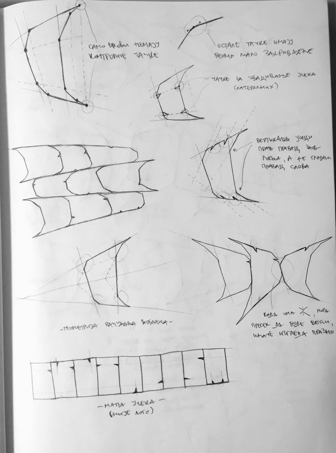
You can see on the bottom right (the three letter “BRU” sketch) that I purposefully tried a “bad” random parameter combination. These parameters make the sketch look bad by choosing short vertical placeholders for leftward oriented “R” and rightward oriented “U”, so the flow is “breaking” at that point. I use this “bad parameter” technique often when designing a generative system, in order to try to find flaws in my reasoning. It is very easy to fall into the trap of designing rules and parameter ranges using satisfying values, without thinking about possible unsatisfactory outliers. I try to obviate this from happening in the design phase, before I write any code.
At this point I was satisfied with my paper encoding of generative rules, so I returned to the keyboard again.
Flow
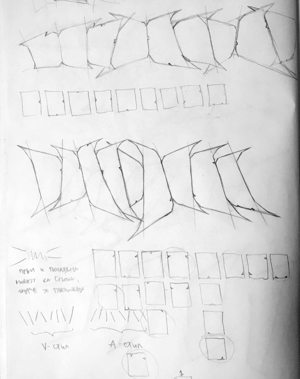
I started adding details to bones & placeholders.
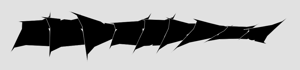
This was a good basis, but it still looked like some fixed sprites jiggling left and right. I started researching vector fields a while ago, and this was just begging to use them.
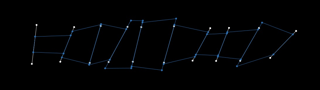
A vector field is an interpolated n-dimensional array of vectors, which you can query for resulting vectors at any point in space. Here’s what it looks like in two dimensions:
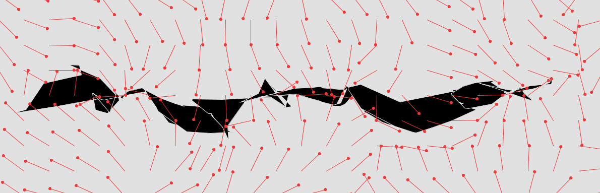
There’s a grid of vectors which are pointing in random directions, and at each point in space you can query the field for a resulting vector which is calculated by interpolating the directions of the four vectors nearest to it In three dimensions, you query 8 vectors, one for each corner of the cube. . In this case, I used a 4×4 vector field to display a debug view of 24×8 vectors (approximately). So a 4×4 vector field was interpolated to show at a 24×8 resolution. The good thing about vector fields is that they’re continuous. You can query them at any resolution you want.
I then proceeded to read vectors from the vector field at each frame’s vertex and apply the offset read from the field to the vertex itself. Effectively, I was using the vector field to move the frame geometry around in a non-linear way.
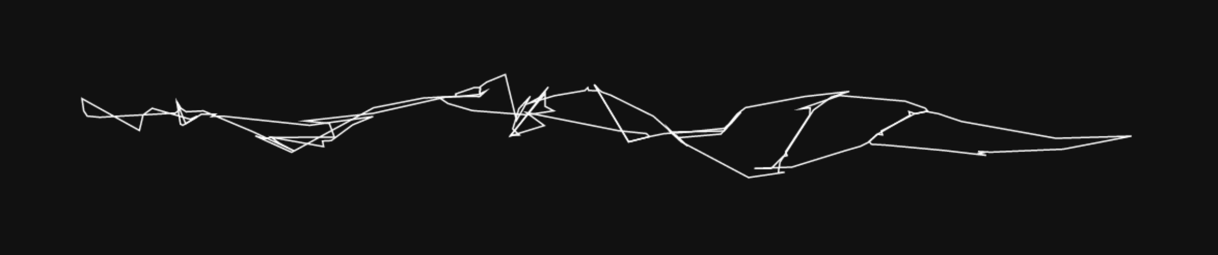
This was beginning to look good, but unfortunately the picture above was handpicked from dozens of “ugly” ones. There were lots of cases where the distortion was completely unsuited for the geometry built in the previous pass:
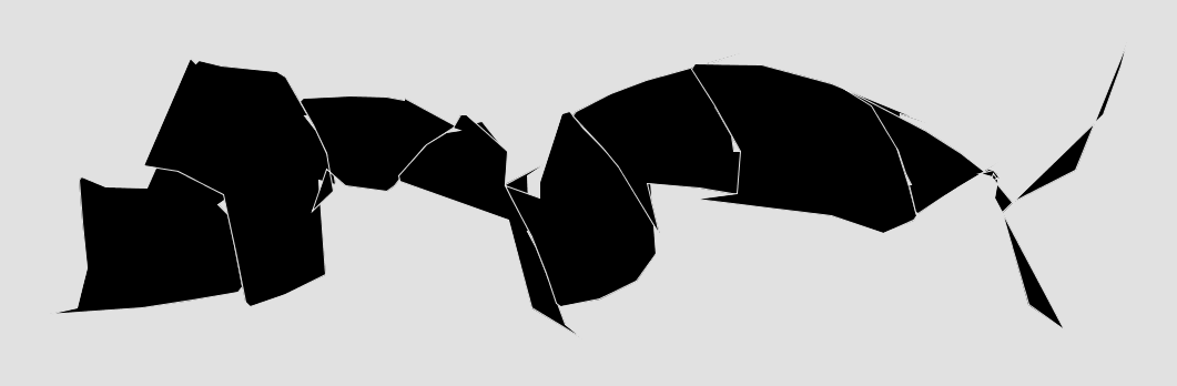
The flow was there, but it was completely uncontrollable. The letters were stretched arbitrarily and there was no unity of distortion – some letters were stretched out, while some were squeezed to nonrecognition.
Taming the distortion
I needed a way to control the vector field. It had to be generated in a way that was parametric and allowed tweaking in a sensible manner.
I started analyzing which vector fields generated better-looking results by manually regenerating the logo hundreds of times, and trying to infer the law by which the “good” distortion behaved. This took a couple of days of obsessive staring into one generated logo after another, but at the end I figured out a solution.
The logos looked best when the vectors around the frame geometry were mostly facing toward it. I could have easily just made them always face towards the geometry (with slight offsets), but then the logo would just look squished and uniform. Additionally, if I were to simply make a system that made vectors on the upper part of the screen face down and vectors on the bottom part face up, the flow would be lost — everything would be one long straight line.
So I came up with a concept I called fault lines — attractors which would “turn” the field’s vectors towards them.
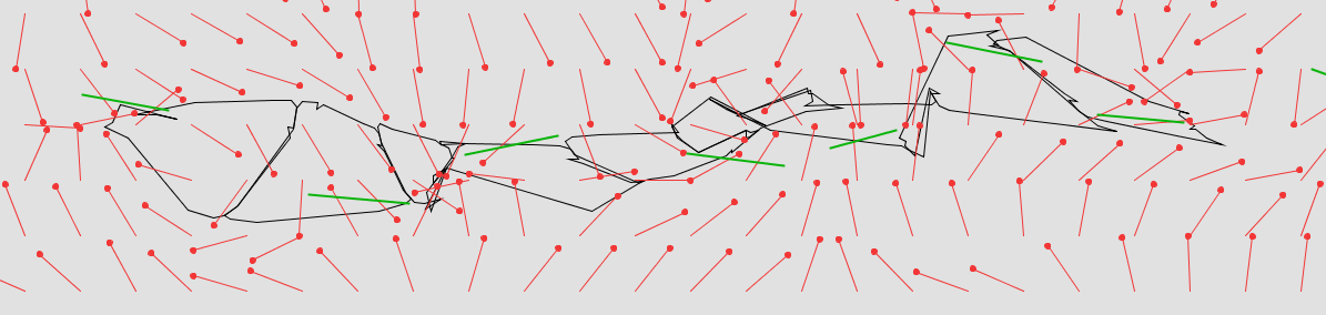
In the picture above, the vectors (red) tend to mostly point I wrote the debug code hastily, so vectors have a circle instead of an arrow on the pointing end. Bummer! towards the nearest fault line segment (green). The logo’s geometry (black) follows the vertical positioning of the fault lines.
This approach preserved the turbulent and random nature of vector fields while giving me the ability to control their influence on the geometry in a precise way.
Sculpting the system
After that, I had everything in place and I could proceed to sculpt the system to suit my taste, to encode it. This took a lot of time, roughly the same amount of time it took to implement the system. Here are a couple of screenshots I captured along the way:
![]()
![]()
![]()
![]()
![]()
![]()
![]()
You can see that I have now completely hidden the original symbol of each letter and that the letters as such are now hidden behind their twisted shapes. This was intentional. By looking at dozens of logo variations, sometimes a variation comes up that reveals a shape of one or two letters to the observer. This way the logo is slowly being deciphered, hopefully.
You can play around with the logo by clicking on it at the bottom of the page, or by checking out the GitHub repo and tweaking it on your own machine.