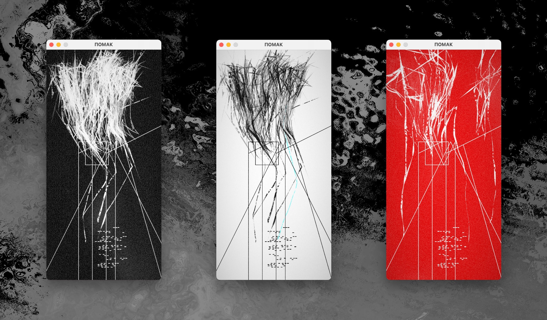
Pomak (pron. poh-muck) is an abstract focus timer More on this elsewhere. for Mac and Windows. It’s small, fast, and written in Rust.
Controls:
- [A-Z] enter interval name
- [Enter] start/pause work interval
- [-] (minus) mute/unmute the sound
- [Cmd+Q] (Mac) / [Alt+F4] (Windows) close the app
Configuration is read on startup from:
- [Mac]
/Users/<your username>/Library/Application Support/rs.brutalism.pomak/pomak.toml - [Windows]
C:\Users\<your username>\AppData\Roaming\brutalism\pomak\config\pomak.toml
Work log is being written to:
- [Mac]
/Users/<your username>/Documents/pomak.csv - [Windows]
C:\Users\<your username>\Documents\pomak.csv
Dissection
A focus timer helps keep you concentrated by dividing your working hours into fixed-size intervals Typically 25 minutes, which is also the default interval length in Pomak. . After you finish a work interval, you get a very short break interval, after which the process repeats. It’s a very effective technique and I’ve been using it a lot over the past decade.
However, I wasn’t pleased with what the current tools had to offer. Not in terms of functionality of course – there are probably hundreds of focus timer apps out there of all shapes and sizes. Hell, even your operating system of choice has some sort of focus timer built in these days.
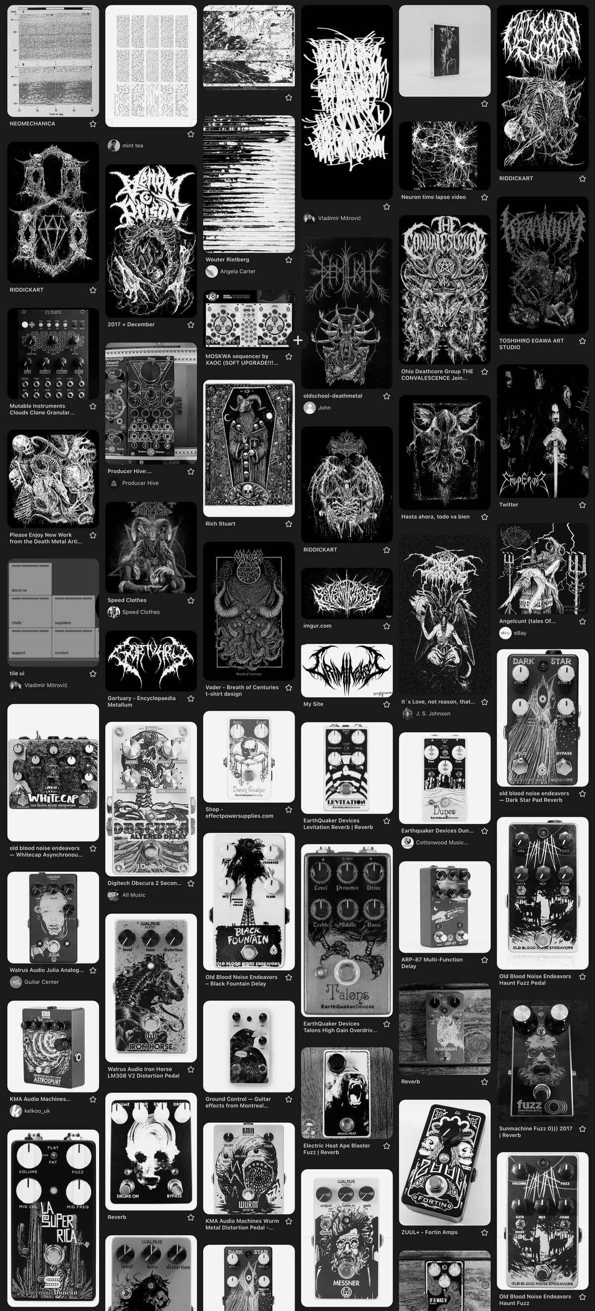
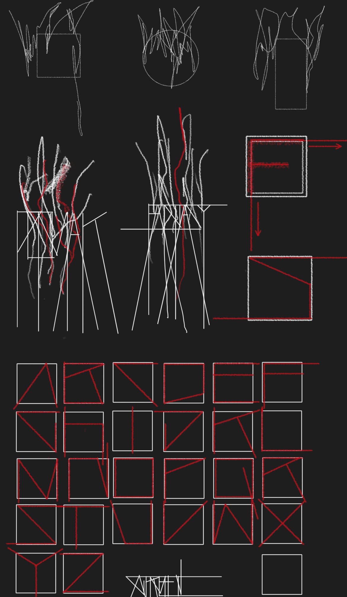
I wanted something visually abstract and aesthetically pleasing. Weird but practical. And even though the end result might look like a freeform generative sketch to an uneducated observer, it is in fact a small data visualization system. Every element is carefully designed to convey information, but also to aesthetically meld with other elements around it. Let’s see how each of them works.
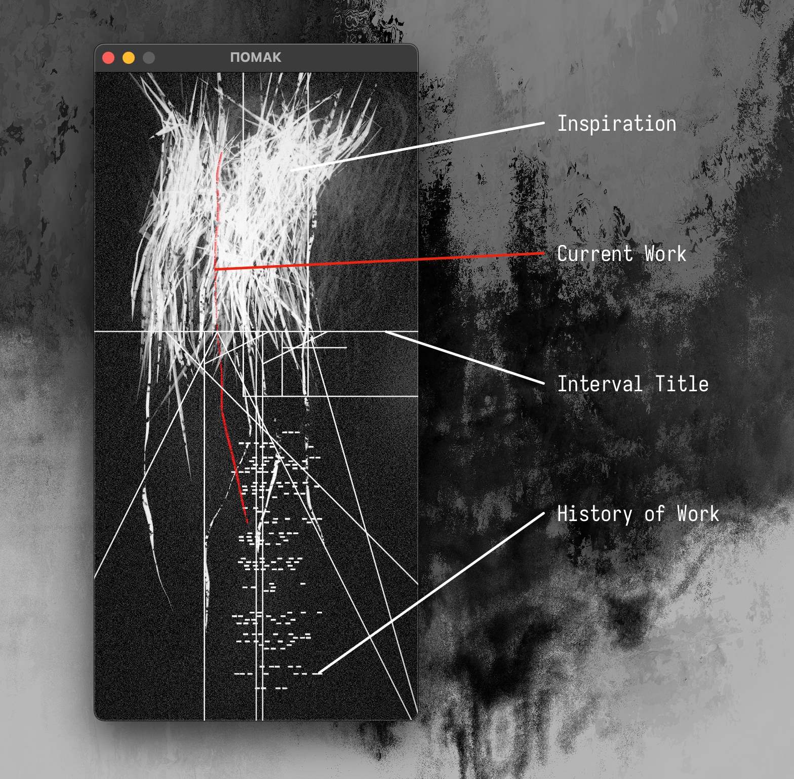
The main abstraction is that of “inspiration” being converted into work – it slowly “drains off” as the work interval progresses and finally flows into its slot in the history grid where it is recorded permanently.
The history grid’s horizontal axis represents 24 hours in a calendar day, with today being on the bottom and going back in time upwards. The history for the previous 90 days is shown, which I felt was the right amount of information to quickly visualize your recent work habits. In the image above, you can see that my focused work time tends to start around 10AM and end around 5PM, and that I’m most productive around noon.
The remaining time on the work timer is intentionally obscured – other than seeing inspiration slowly being “spent”, you don’t really know when the interval started and when it will end. It does end after exactly 25 minutes (or the amount of time you configured in the config file), but you do not need that information being your procrastination gateway while working. This is a bad “micro habit” I developed while working with other focus timer apps – whenever I didn’t feel like doing the task at hand, I kept checking the timer to see when I’d be free of it.
This micro-procrastination is also the reason why the title is completely obscured by the angular aesthetics of the typeface and the extreme negative horizontal spacing. The title does have meaning, in that it is being recorded into the CSV file. However, actually reading it while using the app is of lowest priority. Sometimes when I work on a banal task, I choose a title which simply looks good since I don’t give a damn what will get written into the CSV log.
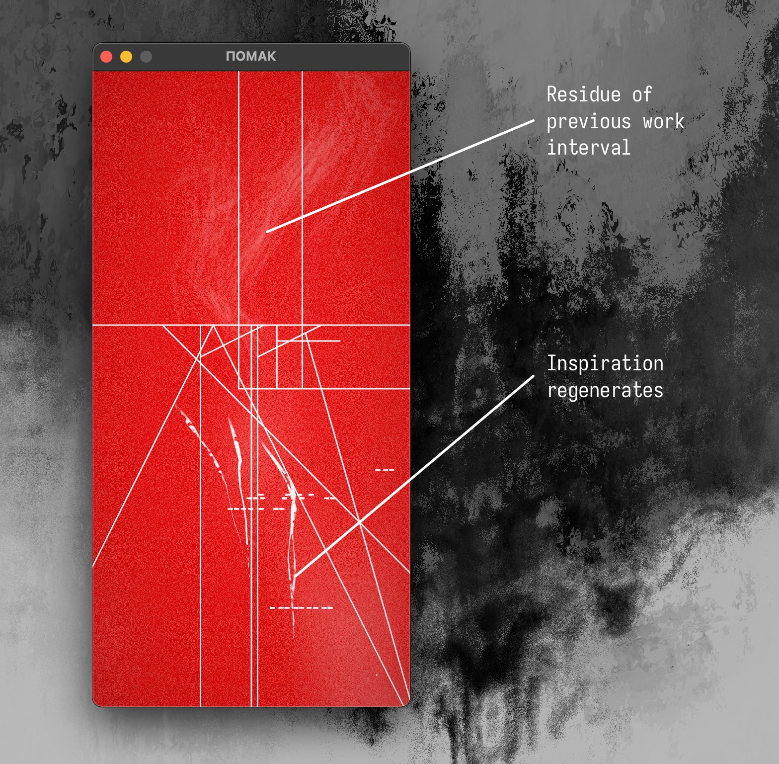
During the break interval, inspiration is being regenerated - a newly (and randomly) generated inspiration shape slowly animates its way onto the canvas. Background is intentionally intensive and almost unpleasant to look at, “forcing” you to step away from the computer. Once inspiration fully regenerates, the background fades to black again and a new work interval can be started by pressing Enter.
Work intervals completed in the current instance of the app leave a faint residue behind - similar to wiping chalk from a blackboard with a dry sponge. This is another layer of history perception, a more immediate one since it brings with it a sense of accomplishment as the background accrues multi-interval residue over time. Through that added detail of visual complexity you perceive that you’ve had a productive day. It’s a very pleasing mechanism.
That’s about it, it’s really a simple little tool!
Final Thoughts
I’m quite satisfied with how Pomak came out aesthetically, and I’m really loving how fast it is to use. The app is small by today’s standards (13MB on macOS) so it loads instantly. As soon as it’s up, the keyboard automatically has focus so you can just type the interval name (or not), hit Enter and you’re on your way.
Developing this app in Rust has been a hugely positive experience for me. The tooling is quite mature and the IDEs are solid (I’m using CLion with its Rust plugin). Even though I’ve picked a very young graphics library as my rendering stack of choice, the community around it has been super responsive and helpful. Huge shout out to folks on wgpu’s Element channel!
Oh, and I think I’ve cured my bad micro-habit of checking the remaining time on the timer. The image doesn’t tell me anything so I just kind of ignore it and get on with whatever I’m supposed to be doing. It turns out that not showing you information you want to see is a good thing sometimes!
Thanks for reading, I hope you enjoy Pomak.