Our visual perception system, with its 20+ billion neurons, is processing more information than all of our other senses combined Information Visualization: Perception for Design, Colin Ware . Its pattern-matching capabilities have evolved immensely over the centuries, giving us the ability to detect both larger patterns and intricate details within milliseconds. We are wired to detect shapes and colors, so why not use this system for visualizing and perceiving data?
Itinerant is an experimental weather forecast app, utilizing the human visual perception system (i.e. recognizing shapes and colors) instead of the symbolic interpretation system (i.e. reading words and numbers). It is an experiment in outperforming traditional weather information data displays in terms of how long it takes to parse and understand the information. Even more importantly, it is an experiment in helping to change the nature of that understanding.

Imprecise by design
We all know and accept weather forecasting to be about approximation. Good forecasts are more accurate than others, but no forecast is ever precise since it is, after all, a prediction See Accuracy and precision on Wikipedia for a quick overview about the differences. . However, contrary to the nature of weather forecasting we are also quite used to our data interfaces presenting us with artificially precise data, giving us an illusion of precision.
Since we’re all used to reading data as symbols, it was natural that the weather forecast interfaces (in TV news segments, mobile apps, etc) would evolve to show us these data points using numbers. We have been trained over time to accept those 23°C shown by the weather app as a promise of some sort, and we accept the fact that it is most probably going to be broken to a certain degree – if you’re directly in the sun it will be hotter, if you’re in the shade it will be a bit cooler, and even more cool if there’s a sudden gust of wind.
For these reasons, Itinerant is intentionally imprecise.
Vague by design
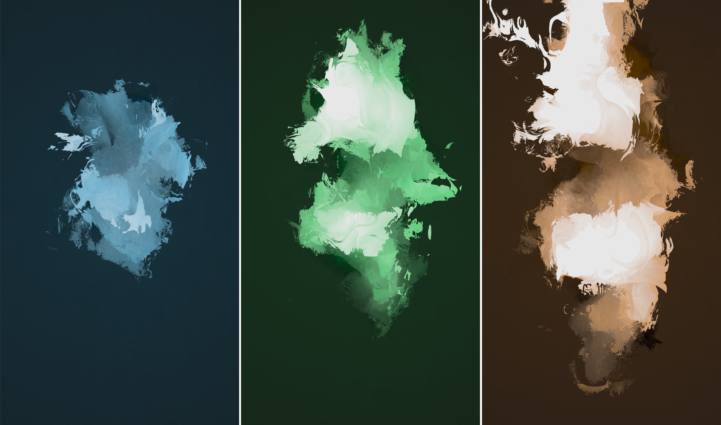
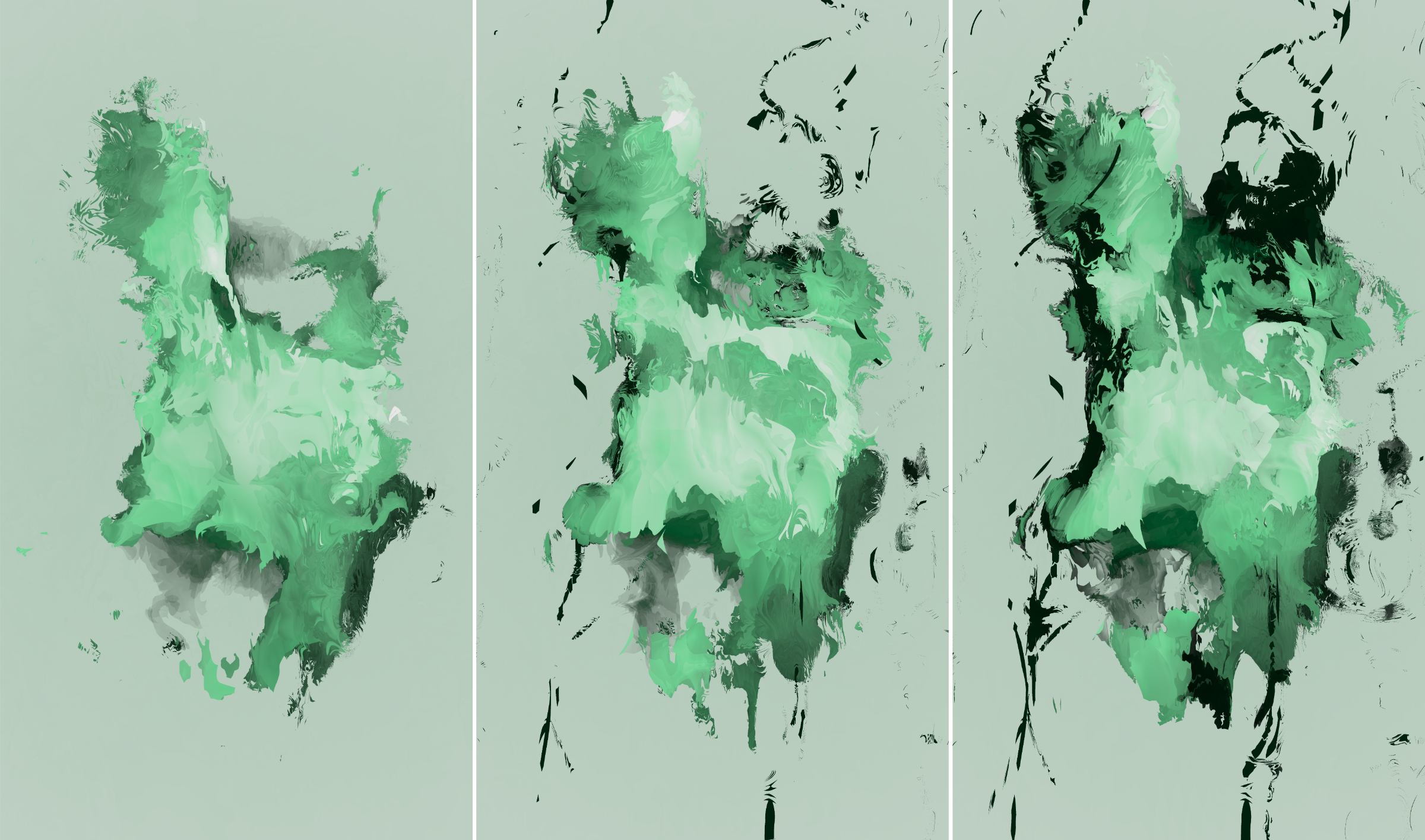
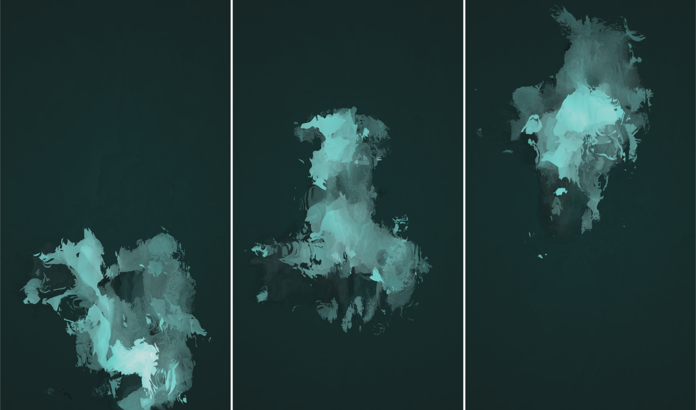
We’re already accustomed to bluer hues representing colder temperatures and orange and red ones representing warmth See temperature maps on DarkSky and you’ll feel familiar with the concept immediately. , but on the other hand we have a hard time remembering exact color shades and we even have difficulty naming color shades in a consistent manner Again, Information Visualization: Perception for Design, Colin Ware , so there’s quite a bit of ambiguity there. For exactly these reasons, color is used to visualize temperature in Itinerant.
Is it 19°C? 23°C? You can’t tell immediately, and that’s the whole point. After using the app for a while, your visual processing system kicks in and you won’t need the auxiliary interface You can access it by tapping the screen once. to help you out anymore because you’ve already memorized the patterns without thinking about it. After a while, that green blob speaks to you, without you even trying.
The second most important question is, of course, will it rain? You are presented with both the probability that it will happen and the precipitation intensity if it does, but all you can tell is: maybe.
Another metric I think is useful but is mostly ignored by traditional weather apps is: how cold or warm it will be compared to yesterday? The vertical offset tells you the difference in temperature between the currently observed point in time and a point in time 24h before it:
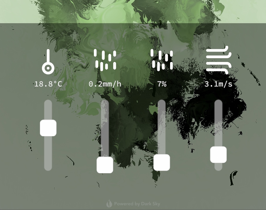
A crucial part of the app is actually memorizing the patterns, and for this purpose there’s an auxiliary interface which can be brought up by tapping the screen. All data point values are presented as sliders, so you can play around with them and “train the eye” to map the hard values into abstract shapes and colors.
Sensory-driven visualization has a lot of potential for visualizing approximations, intangible datasets, stochastic processes, complex data point interconnections, high-throughput streams, unstructured data, etc. I will most certainly be spending more time in these waters in the months ahead. While traditional methods are very good at showing us data in a strict, precise, almost mechanical way, sensory-driven visualization can be there to give us hints, intuition, hope. There are problem spaces for both.
Download Itinerant on the iOS app store. Itinerant was available on the iOS app store from April 2019 to August 2022. It is currently unmaintained and unavailable for download.