Since releasing Itinerant I’ve been working on two new projects in parallel. I’ve been slow to post on the website in the past couple of months, so I thought a quick research update is a good way to break the silence.
Memoization
I’m currently researching memoization related to visual processing, with plans for it to be the main feature of a developer tool I’m currently working on (I’ll share more details once I have something concrete to show). When a large set of similar three-dimensional features is laid out on a plane, what is the optimal layout so that the individual features are immediately easily recognizable?
My main point of reference are city maps. You can immediately discern a map of New York from a map of Belgrade from a map of London. Why?
Distinct features vs. regularity
There are already different techniques for visualizing hierarchical data on a two-dimensional surface, so I spent a couple of days researching some whitepapers and googling around. Here’s a selection of examples which I found relevant to the problem I’m trying to solve:
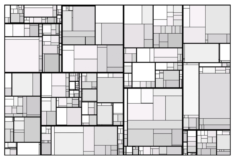

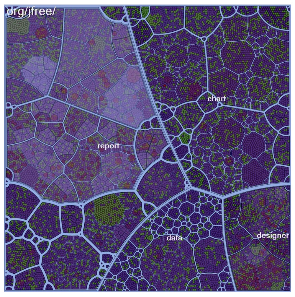
None of these approaches do quite what I need. I’m looking for distinctive “anchoring features” which allow the user to instantly identify sections of the image and orient themselves relative to the current camera position when the arrangement is viewed in three dimensions. Three-dimensional geographic maps do a better job at conveying these anchoring details:
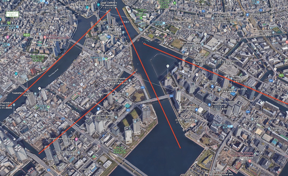
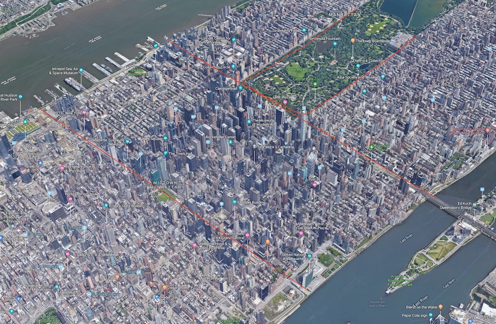
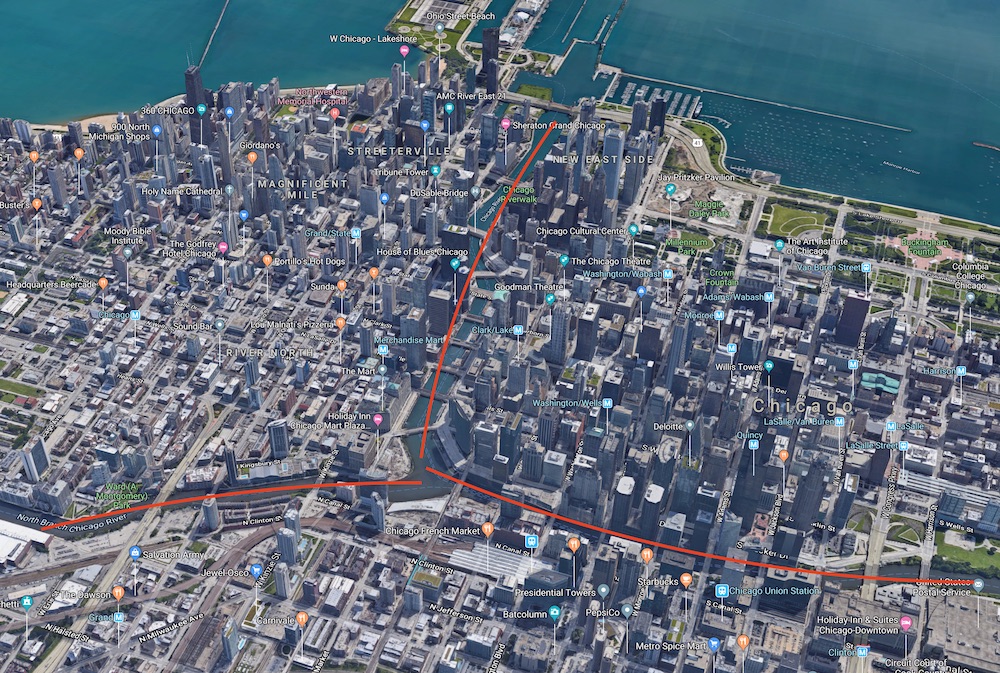
I’ve highlighted these “distinguishing features” in red. Even though the buildings are laid out in an almost perfect grid-like fashion, you can easily orient yourself when looking at the map from any angle due to a small number of very prominent visual features which help you form a mental picture of your position relative to what’s being shown. These three-dimensional maps are probably triggering the parts of our brain which we use to orient ourselves in space. I need to research this topic some more.
However, not all maps are easy to “read” immediately:
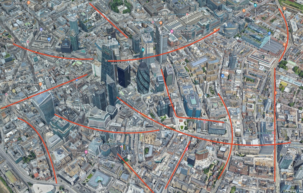
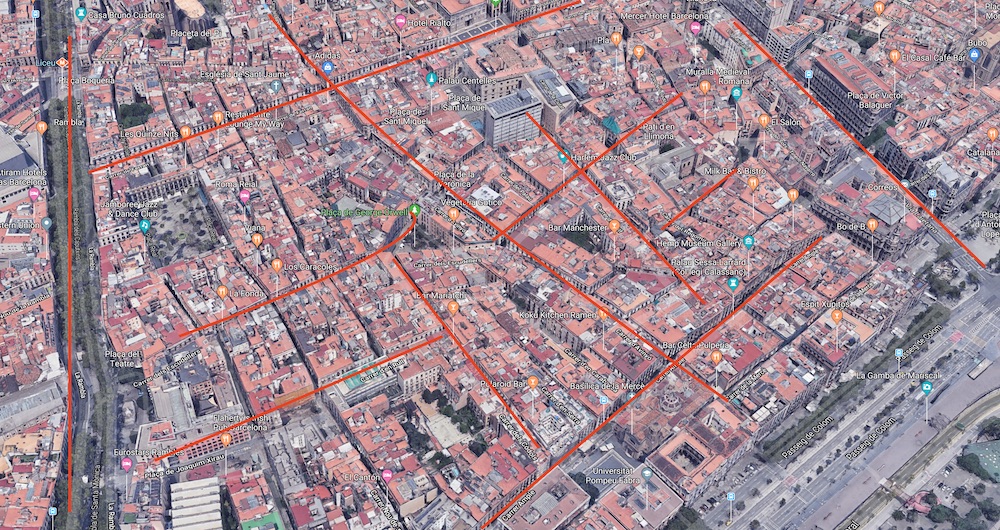
When there are too many of these “distinguishing features” and/or when they are laid out in a seemingly random fashion, it becomes very hard to discern which part of the map you’re looking at. If you rotate the viewpoint, it’s very hard to reorient yourself because the visual processing system has too few “handles” to latch onto.
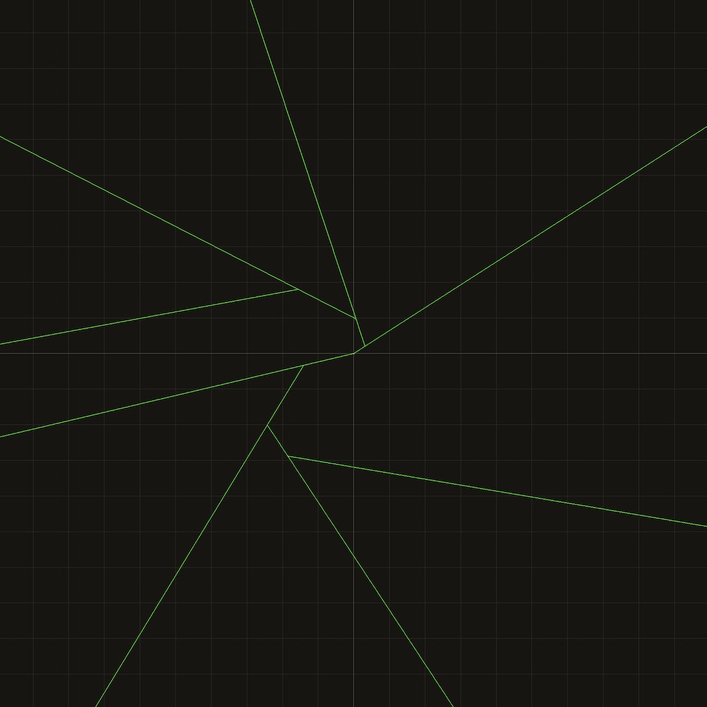
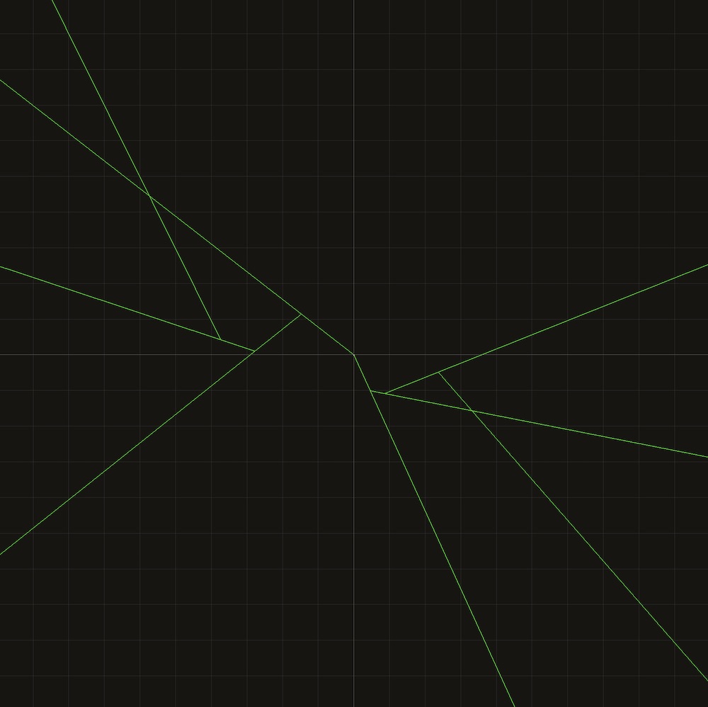
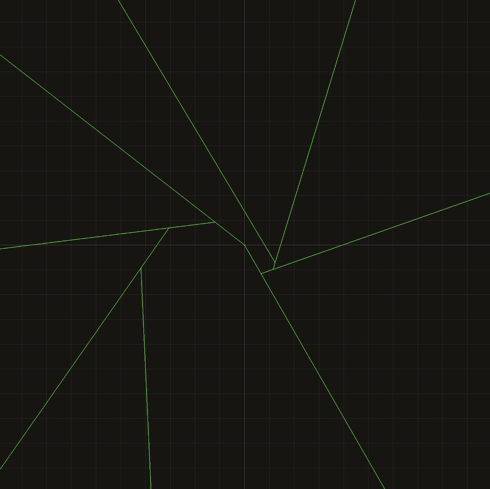
So, what I’ve learned from this is that a good balance of distinguishing features (randomness) and grid-like layouts (regularity) works best. I’m currently working on an algorithm which generates distinguishing features, and will then proceed with the layout algorithm inside of each delineated region.
Preattentive processing
Continuing with my marathon reading of Colin Ware’s excellent Information Visualization book, I’m currently researching preattentive processing Preattentive processing on Wikipedia. . I’m trying to find ways to map multiple data dimensions onto the same three-dimensional display, without using overlays or separate “modes” of viewing the data.
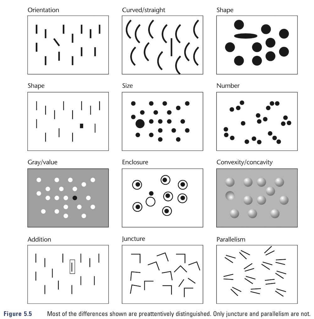
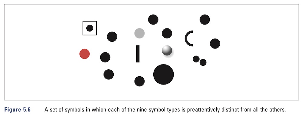
I’m also researching what Mr. Ware calls “graphemes” and how I can incorporate them into the details of the visualization.
We use the term grapheme to describe a graphical element that is primitive in visual terms, the visual equivalent of a phoneme. The basis of the grapheme concept is that the pattern that most efficiently excites a neuron in the visual system is exactly the pattern that the neuron is tuned to detect. Thus, the most efficient grapheme is one that matches the receptive field properties of some class of neurons.
An orientation detector will be excited most efficiently by a pattern whose light distribution is exactly the same as the sensitivity distribution of the cell. This is simply another way of saying that the detector is tuned to that particular pattern. Once we understand the kinds of patterns the tuned cells of the visual cortex respond to best, we can apply this information to create efficient visual patterns. Patterns based on the receptive field properties of neurons should be rapidly detected and easily distinguished.
I’m planning for this tool to be a very useful day-to-day helper (I’ll be using it myself heavily), so it will be a bit less abstract than Itinerant in terms of conveying information. Of course, it won’t be an analytical tool because there are already excellent analytical tools everywhere, bleh.
Unity toolchain
My switch to using Unity’s job system and the Burst compiler is going well so far. I’ve managed to convert the marching cubes and Bezier curve extrusion algorithms into idiomatic jobified code, so the performance is now pretty crazy. I’m seeing roughly an 8x speed improvement for the marching cubes algorithm compared to my regular threaded C# version.
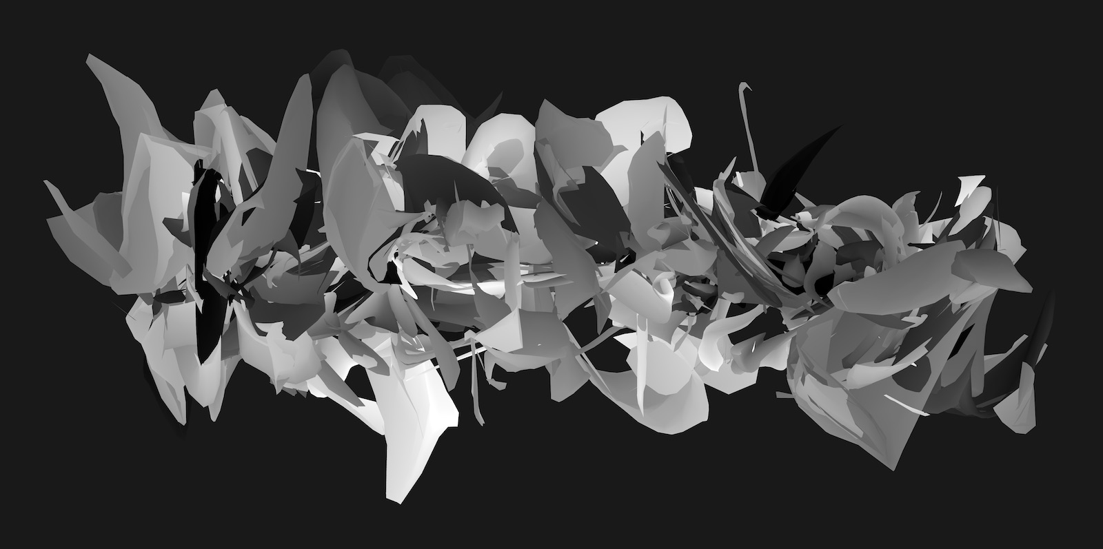
I’m currently using this stack to work on a new art project, possibly another aesthetic engine. Possibly a screensaver.
I’m also looking into using xNode xNode on GitHub. for converting my custom job pipeline into a nice graphical representation so I can get away from creating game objects and attaching components to them – all I really need is a computation graph. I’ve spent some time researching Unity’s ECS library as well, but using it just to do procedural geometry generation is simply overkill. Burst jobs with some added sugar on top will do just fine.
Onward.